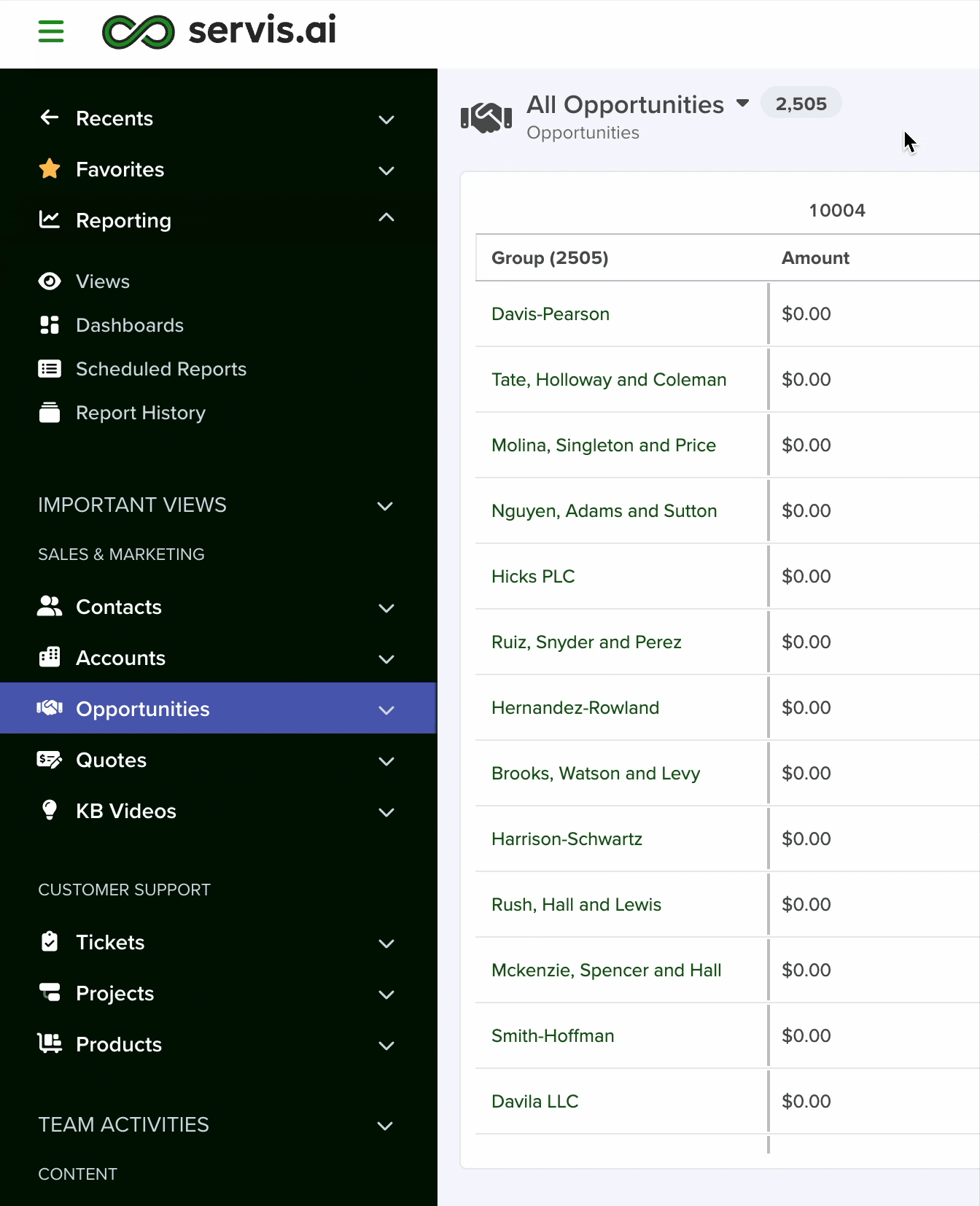
The Pivot Table View is a powerful way to summarize, group, and analyze your data inside any servis.ai app. Instead of scrolling through a list of records, a pivot table reorganizes your information into a cross-tabulated grid – rows grouped by categories you choose, columns split by values you pick, and cells filled with aggregated numbers like sums, averages or counts.
Think of it as building a report on the fly: you drag fields into Row Groups, Pivot Columns, and Values, and servis.ai instantly calculates the results.
When to use a Pivot Table
- Summarize sales by region and quarter
- Count deals by stage per sales rep
- Compare revenue across product categories
- Track activity totals over time (weekly, monthly, quarterly)
Navigate to the Pivot Table Tab
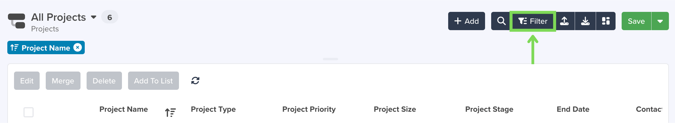
To access the Pivot Table tab, navigate to an existing App view and select the Filter button in the top right hand side of the page.
The Filter, Sort & More window will appear. Select the Pivot Table tab in the top right hand side of the window.

Configuring the Pivot Table
The Pivot Table is configured through the Settings panel on the right side of the screen. The configuration is organized into four sections:
- Row Groups – the fields that define the rows of your table
- Pivot Columns –the fields that define the dynamic columns across the top
- Values – the fields and calculations that fill the grid cells
- Grid Settings –display options for totals, empty values, and time buckets
From the Pivot Table, select the Configuration tab.

Note: You can apply your configuration by clicking the Apply button. Changes are not applied until you click Apply.
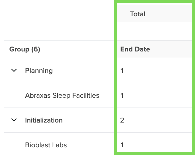
Row Groups
Row Groups determine how the rows in your table are organized. Each row group fields creates a level of grouping. Record that share the same value for that field are collapsed under a single group header.
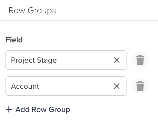
Adding a Row Group
- In the Row Goups section of the settings panel, click Add Row Group.
- Select a field from the dropdown. Only fields that make sense for grouping are shown (text, catalog/picklist, refernce, date, boolean, etc.).
- To add a second or third level of grouping, click Add Row Group again and choose another field.
Note: You can add up to 5 row group levels. The groups are displayed hierarchically – you can expand and collapse each level.
Supported Field Types for Row Groups
|
Field Type
|
Example
|
|---|---|
|
Text
|
Stage, Priority, Status
|
|
Catalog (Picklist)
|
Industry, Category, Region
|
|
Reference
|
Account, Assigned To, Owner
|
|
Reference Array
|
Tags, Related Contacts
|
|
Date
|
Close Date, Created Date
|
|
DateTime
|
Last Activity, Due Date
|
|
Boolean
|
Active, Closed Won
|
|
Number / Currency
|
Amount brackets
|
|
Percent
|
Discount percentage
|
|
Phone
|
Phone number
|
Dot-Walking for Row Groups
You can group fields on a related record. For example, your Deals app has an Organization (reference) field, you can group deals by the Organization’s Level. This is called dot-walking.
To use dot-walking, select the reference field and then choose a field from the related app.
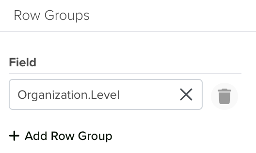
Note: The only dot-walking entity supported for Row Groups is Organization.
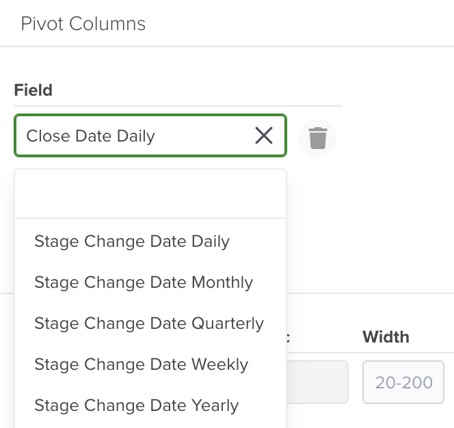
Pivot Columns
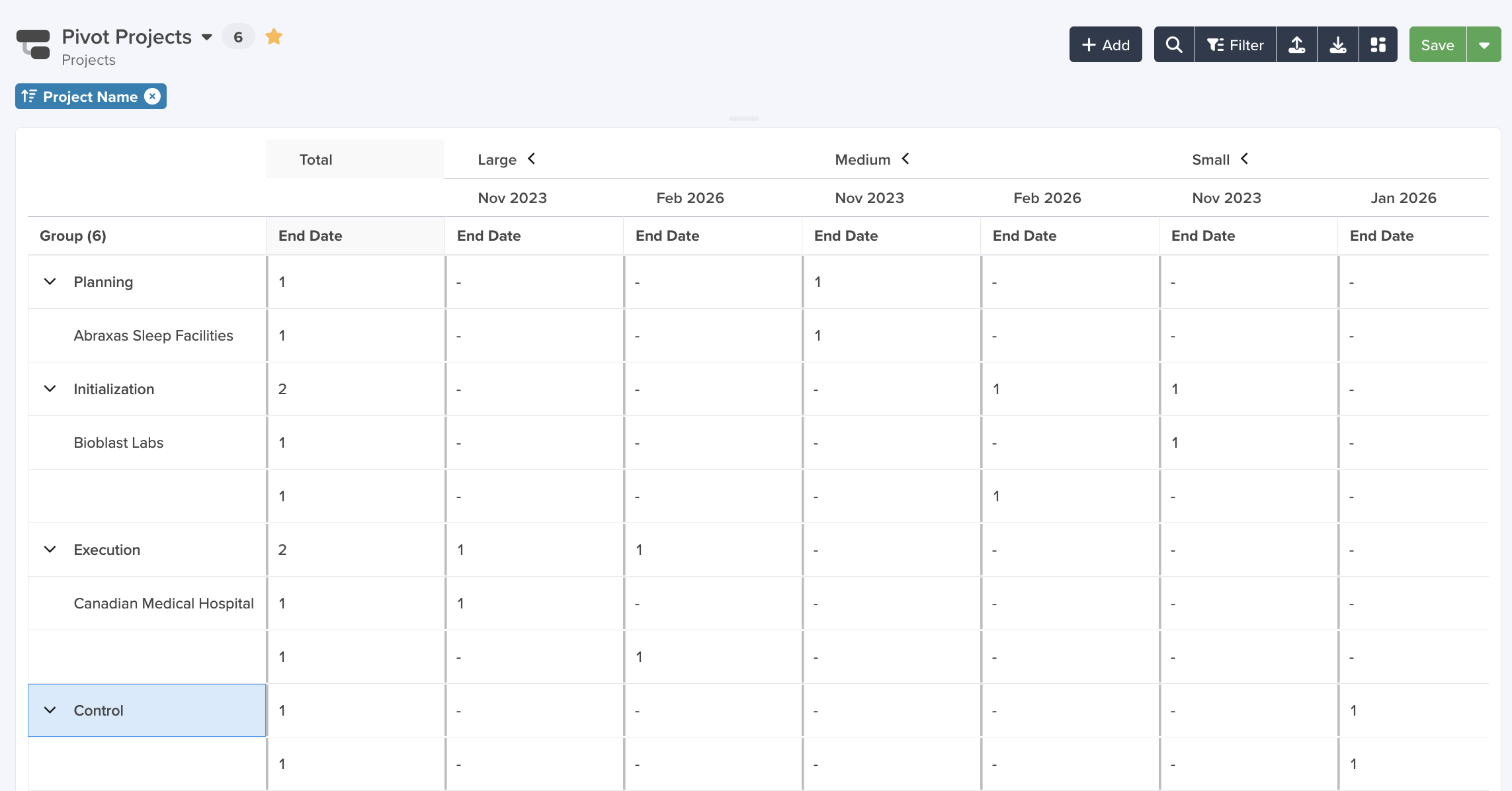
Pivot Columns turn the unique values of a field into separate columns across the top of the table. For example, if you pivot by Stage, you get a column for each Stage Value (e.g., Prospecting, Qualification, Closed Won).
Adding a Pivot Column
- In the Pivot Columns section of the settings panel, click Add Pivot Column.
- Select a field from the dropdown.
Note: You can add up to 3 pivot column fields. When you add multiple pivot columns, the table creates nested column headers.
How Pivot Columns Work
If you select Stage as a pivot column and Sum of Amount as a value, the pivot table creates one column per stage, each showing the um of the Amount field for records in that stage.
|
Group
|
Prospecting
|
Qualification
|
Closed Won
|
Total
|
|---|---|---|---|---|
|
North America
|
$12,500
|
$28,000
|
$95,000
|
$135,500
|
|
Europe
|
$8,200
|
$15,400
|
$62,000
|
$85,600
|
Supported Field Types for Pivot Columns
Pivot Columns support the same field types as Row Groups:
|
Field Type
|
Example
|
|---|---|
|
Text
|
Stage, Priority, Status
|
|
Catalog (Picklist)
|
Industry, Category, Region
|
|
Reference
|
Account, Assigned To, Owner
|
|
Reference Array
|
Tags, Related Contacts
|
|
Date
|
Close Date, Created Date
|
|
DateTime
|
Last Activity, Due Date
|
|
Boolean
|
Active, Closed Won
|
|
Number / Currency
|
Amount brackets
|
|
Percent
|
Discount percentage
|
|
Phone
|
Phone number
|
References as Links
All the refernced records inside the Pivot Table are link to their own details page.
Column Ordering
Pivot columns are sorted chronologically for date-based groupings (see Date and Time Grouping below). For non-date fields, columns are sorted alphabetically. You can drag columns to reorder them manually, and the custom order will be saved in the view.
Note: The Total column cannot be dragged – its position is controlled by the Display Total setting in Grid Settings.
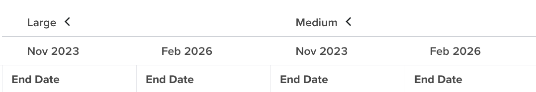
Date and Time Grouping
When you use a Date or DateTime field as a Row Group or Pivot Column, you can choose how records are grouped by time period. This lets you analyze trends over days, weeks, months, quarters, or years.
Available Grouping Options
|
Grouping
|
Label
|
Example
|
|---|---|---|
|
Yearly
|
Yearly
|
2025, 2026
|
|
Quarterly
|
Quarterly
|
Q1 2025, Q2 2025
|
|
Monthly
|
Monthly
|
Jan 2025, Feb 2025
|
|
Weekly
|
Weekly
|
Week 49, 2025
|
|
Daily
|
Daily
|
2025-12-01
|
How to Use Date Grouping
When you add a Date or DateTime field as a row Group or Pivot Column, a Value dropdown appears next to the field selector. This dropdown lets you pick the time granularity.
- Add a Date field (e.g., Close Date) as a Row Group or Pivot Column.
- In the Value column, select the grouping level: Yearly, Quarterly, Monthyly, Weekly, or Daily.
- The table groups all records by the selected time period.
Sorting Behavior
Date-grouped columns are always sorted in chronological order (earliest to latest), not alphabetically. This ensures that Jan 2025 appears before Feb 2025, and Q1 2025 appears before Q2 2025.
Empty or blank date values always sort last (after all dated entries), following standard spreadsheet conventions.
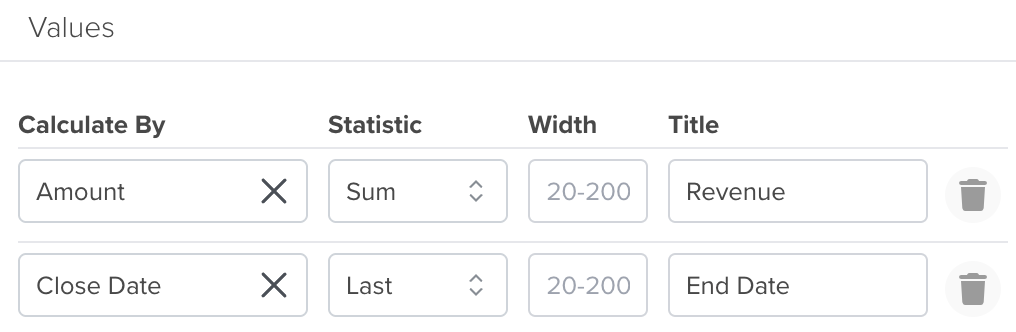
Values
Values are the fields that get calculated and displayed inside the grid cells. Each value has two parts:
- Calculate By: Field – which field to calculate (e.g., Amount, Probability)
- Statistic: Aggregation Function – how to calculate it (e.g., Sum, Average, Count)
Adding a Value
- In the Values section, click Add Value.
- Select a Field from the first dropdown.
- Choose an Aggregate Function from the second dropdown.
- Optionally, set a Width (column width in pixels, between 20 and 200) and a Title (custom header name).
Custom Width and Title
For each value field, you can customize:
- Width – Set the column width in pixels. The range is 20-200 pixels. If left blank, the default width (150px) is used.
- Title – Replace the default header with a custom label. For example, instead of “Sum of Amount”, you can display “Revenue”.
Supported Aggregations (by Field Type)
The aggregate functions available depend on the type of field you select. Not all calculations make sense for every field type – for instance, you can’t sum text fields.
Numeric Fields (Number, Currency, Percent)
Numeric fields support the full range of aggregation functions:
|
Function
|
Description
|
|---|---|
|
Sum
|
Adds up all numeric values in the group
|
|
Avg
|
Calculates the average (mean) of the values
|
|
Min
|
Finds the smallest value in the group
|
|
Max
|
Finds the largest value in the group
|
|
Count
|
Counts the number of non-empty records
|
|
First
|
Returns the first value in the sort order
|
|
Last
|
Returns the last value in the sort order
|
Note: When you select a numeric field, the default aggregation is Sum.
Date Fields (Date, DateTime, DateTimeComplete)
Date fields support chronological aggregation:
|
Function
|
Description
|
|---|---|
|
Count
|
Counts the number of non-empty date values
|
|
First
|
Returns the earliest date in the group
|
|
Last
|
Returns the latest date in the group
|
Note: When you select a date field, the default aggregation is Count.
All Other Fields
Non-numeric, non-date fields support one aggregation:
|
Function
|
Description
|
|---|---|
|
Count
|
Counts the number of non-empty records
|
Grid Settings
The Grid Settings section controls how the pivot table displays totals, empty cells, and time gaps.
Totals
The Display Total dropdown controls whether a grand total column appears in the table, and where:
|
Option
|
Behavior
|
|---|---|
|
First
|
The Total column appears at the left side of the pivot columns
|
|
Last
|
The Total column appears at the right side of the pivot columns
|
|
Hide
|
No Total column is shown
|
Default: Last.
The Total Column aggregates across all pivot column values. For example, if your pivot columns are Q1, Q2, Q3, Q4, the Total column shows the combined result for the entire year.
Total columns have a distinct visual style – a subtle background color – and they cannot be dragged to a different position. To move the Total column, change the Display Total setting.
Totals are calculated based on the selected aggregation(s).
Empty Values
You can control how empty values display:
- Blank

- Dash (-)
- Number (0)


Empty Time Buckets
The Show Empty Time Buckets checkbox controls whether time periods with no data still appear as columns (or rows) in the pivot table.
|
Setting
|
Behavior
|
|---|---|
|
Unchecked (default)
|
Only time periods that have data appear in the table
|
|
Checked
|
All time periods in the range appear, even those with no records
|
When enabled: The system fills in gaps in the timeline with empty columns. For example, if you group by Month and your data has records in January and March but not February, the February column still appears (with empty or zero values, depending on your Empty Values setting).
Natural boundary expansion: When filling time gaps, the system expands to natural boundaries:
|
Grouping
|
Boundary
|
|---|---|
|
Daily
|
Expands to the full month (fills all days in the month)
|
|
Weekly
|
Fills all weeks between the earliest and latest data point
|
|
Monthly
|
Expands to the full quarter (fills all months in the quarter)
|
|
Quarterly
|
Fills all quarters between earliest and latest data point
|
|
Yearly
|
Fills all years between earliest and latest data point
|
Example: If your data spans from February 10 to April 15, and you group by Month with Show empty Time Buckets enabled: -The systemt expands from the start of Q1 (January) through the end of Q2 (June). – All six months appear as columns, even if some have no data.
Note: Large datasets, multiple group levels and reference field grouping can increase load time.