Mobile Cards allow you to customize how app records are displayed in the Servis.ai Mobile App, giving users a streamlined and intuitive mobile experience. This guide walks you through how to access, configure, and preview your Mobile Card setup—making it easy to control which fields appear, how they look, and in what order.
Whether you’re enhancing usability or aligning your mobile layout with your web view, setting up a Mobile Card helps ensure your users see the most relevant information on the go. Let’s get started.
Permissions: Only Administrators can configure Mobile Cards.
Navigate to Mobile Card
To set up the Mobile Card:
-
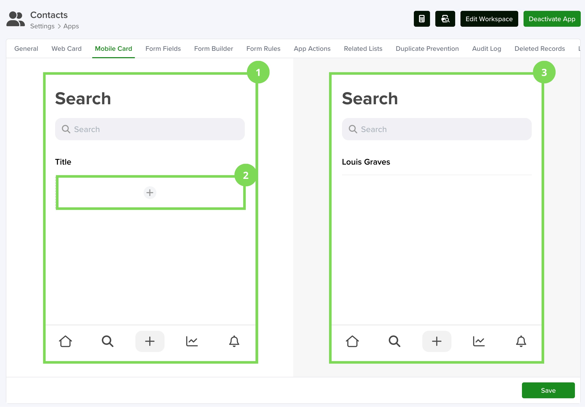
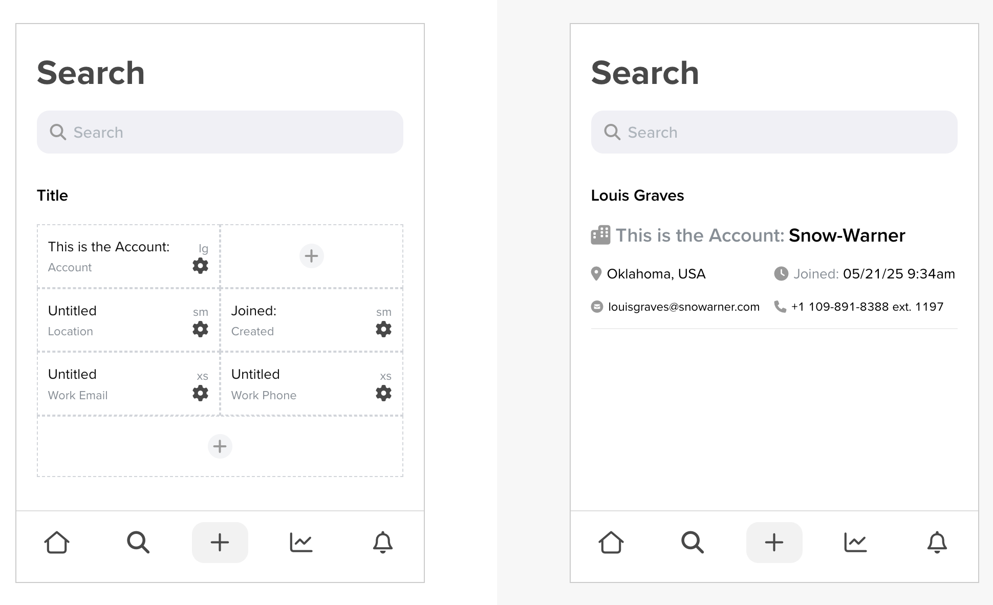
Go to Settings > Apps > [Your App] > Mobile Card.
-
You’ll see two panels:
- Left panel: This is the builder where you can add, remove, and edit components.
- Right panel: A live preview of the configuration you’re building on the left.
The process is similar to configuring a Web Card. For step-by-step instructions on that, refer to this article.
The card settings you define here will apply to all records within the selected app.
You can repeat this process for each of your apps to control how their records appear in the Servis.ai Mobile App.
Configure your Mobile Card
1.- Main Editor
The Main Editor, located on the left side of the screen, just like the right side panel, mirrors what users will see in the Servis.ai Mobile App.
Here, you can add, arrange, and edit components. Any changes made are instantly reflected in the live preview on the right.
2.- Adding Components
To begin adding components:
- Click the “+” icon in the editor.
- This will reveal three sections:
- The top two sections are where you can insert your components.
- The bottom section adds more space to include additional components.
Clicking one of the top sections will open a selection window where you can:
- Choose the data fields you want to display.
- Customize how each component looks and behaves.
Configure Cell
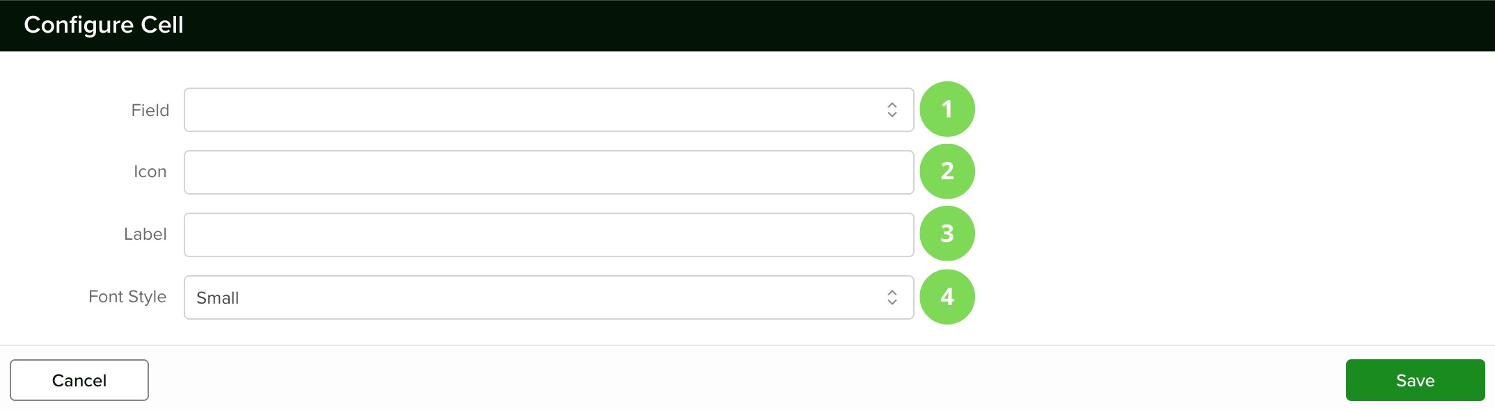
1.- Field
Use this dropdown to select which field will be shown for each record.
For example, if you choose the Account field in your Contacts app, it will display the account linked to that contact.
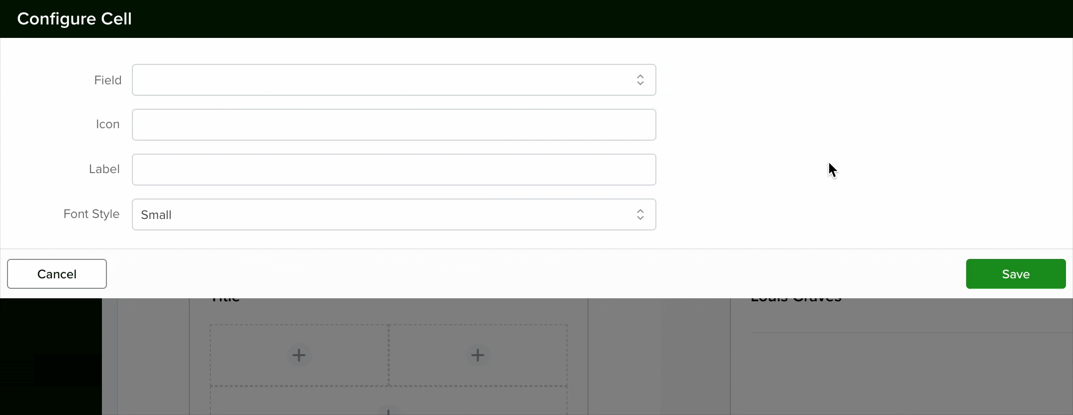
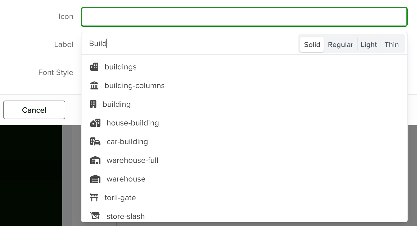
2.- Icon
Here, you can choose an icon to represent the field you selected earlier.
Pick the one that best matches the meaning or purpose of your field to enhance visual clarity.
3.- Label
This is a short text that appears before the value of the selected field.

You can see how it looks in real time within the Preview Panel.

4.- Font Style
Choose from four font sizes: Large, Medium, Small, or Extra Small.
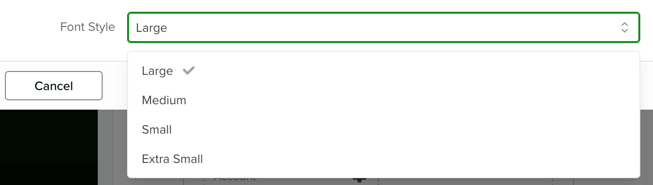
The selected style will be reflected instantly in the Preview Panel.
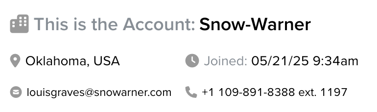
3.- Preview Panel
This panel shows a real-time preview of all the changes you make to your components, updating instantly as you edit.
Saving Your Changes
To apply your updates, make sure to click the Save button located at the bottom right of the page.
Note: If you don’t customize the Mobile Card, the Servis.ai Mobile App will display records using the Web Card configuration by default.
