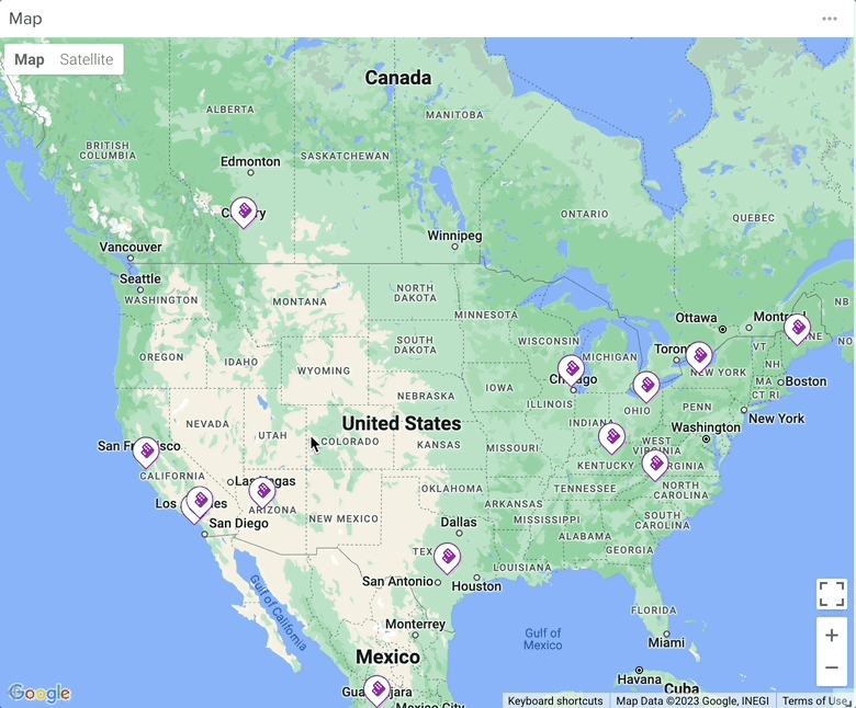
Add this to any Dashboard, Dashlet, Page, or Workspace to map the Latitude and Longitude of all the records that match your filter conditions. Hover over any marker to see the card for that record.
Configuration
As you configure your widget you’ll see the view in the right panel update in real time to reflect the changes you’ve made.

1. Title
This will add a title for your widget in the top left-hand corner of the screen.
2. App
This field is for choosing the application your map will be used for. Google Maps will be limited to displaying the records from the application you choose here.
Click the ‘Save’ button once you’re finished configuring your widget.
3. Condition
You can fine-tune what items you see from the application you chose earlier.
Below I’m creating a filter that will only show me the Accounts that met the conditions
You can add as many filters as you like.

You can also decide how you would like the information sorted.

4. Field
This list will contain all the location-based fields in the application you chose earlier. Choose one to base your map locations on.
Your map will update in real time as you make changes to your settings.

5. Color Pin By
You can assign custom colors to pins based on a value assigned to them. Here you can choose the field those values are coming from here. In this example I’ve chosen to base pin colors on the type of industry the companies are in.

6. Values
Here is where you choose the actual colors to assign to each value. Just click on the ‘+Add’ button to add more colors.

7. Pin Icon
Choose an icon to appear on your pins.

Card Layout
Click the gear icon to configure the card that appears when you hover over an icon on the map. This card displays key information from the record linked to the selected app.


This will open the form to configure the card layout:

Default
- Layout: Choose the structure for how information is displayed within the card. We recommend selecting the Card option, as it offers the most space for displaying all relevant details.
- On Click Action: Define what happens when a user clicks on the card. By default, this action opens the detail page of the associated record.
Card Header
- Color Card By: Choose a field from the selected app to define the color of each card. This helps visually differentiate records based on specific values.
- Cover Image: Select a field that contains an image to display as the card’s cover.
- Show in Landscape: Display the card in a horizontal (landscape) orientation for a wider layout.
- Card Title: Choose the field that will appear as the card’s title. By default, this is set to the Name field.
- Show App Icon: Enable this option to display the selected app’s icon next to the card title. The icon adjusts automatically based on the app being used.
Card Body
This section lets you customize how information is shown within the card. You can:
- Rearrange the order of fields
- Choose whether to display field labels
- Add new fields or remove existing ones
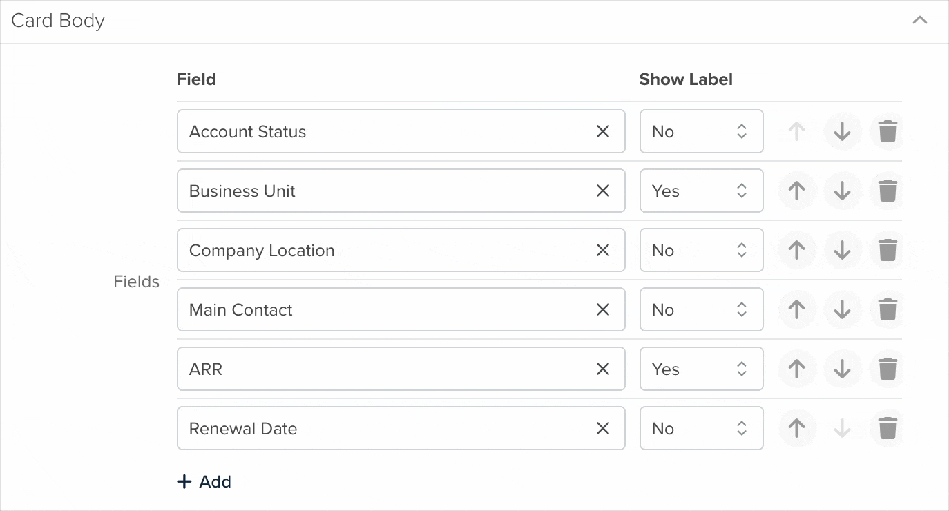
All changes are reflected in real time, allowing you to instantly preview the updated card layout.
Card Footer
In this section, you can define what appears at the bottom of the card. Options include:
- Adding one or more actions for quick interaction
- Displaying related lists for easy access to connected records
- Showing the record ID and user-related details to help identify the nature of the record

These elements enhance the card’s functionality and provide quick reference tools directly within the card.

Navigating Maps
You can use your mouse to drag the map to different locations. Use the buttons in the bottom right corner to zoom in and out. Hover your cursor over the markers on the map to get more information about each record.
