Dashboards are your visual command center in servis.ai. They let you gather charts, metrics, lists, calendars, and other widgets on a single page so you can see everything that matters at a glance. Whether you want to track sales performance, monitor project progress, or keep an eye on customer activity, Dashboards bring it all together in one place.
This guide covers every aspect of the Dashboards feature – from creating your first dashboard and adding widgets, to filtering, exporting, sharing, and scheduling reports. By the end, you will know how to build and customize dashboards that give you the exact insights you need.
Edition Qualifier: The Dashboards feature is available in all servis.ai Editions and is accessible to all users. Some advanced options (such as Refresh and Scheduled Report) are available only to users with Admin permissions.
Navigating to Dashboards
To open the Dashboards section, click the Navigation Menu (the sidebar on the left side of the screen) and go to Reporting, then select Dashboards.
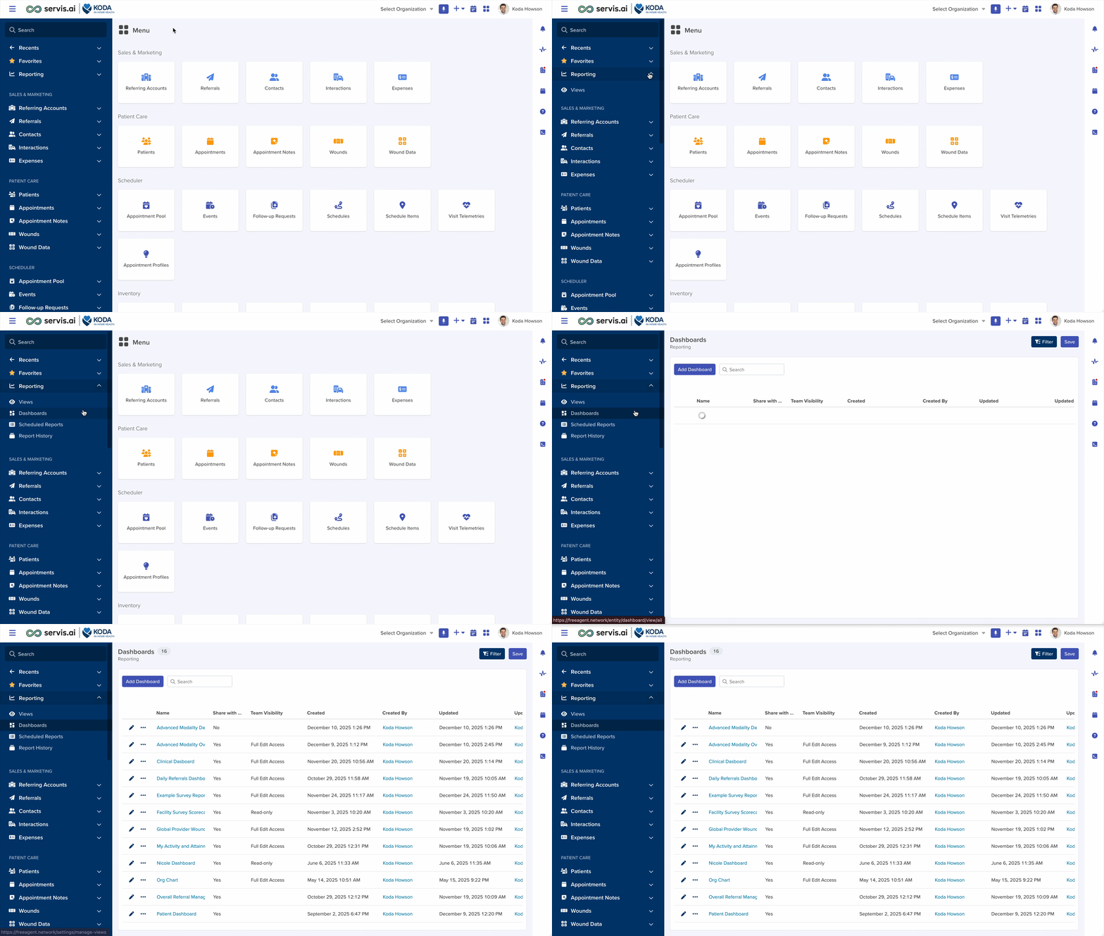
The Dashboards Listing Page
When you first open Dashboards, you land on the listing page. This page shows all the dashboards you and your team have created. From here you can open any existing dashboard or create a new one.
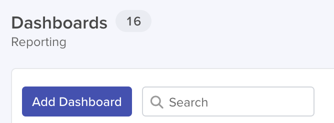
Add Dashboard Button: In the upper area of the page you will find a button labeled “Add Dashboard”. Click it to create a new dashboard. This is the starting point for every new dashboard you build.
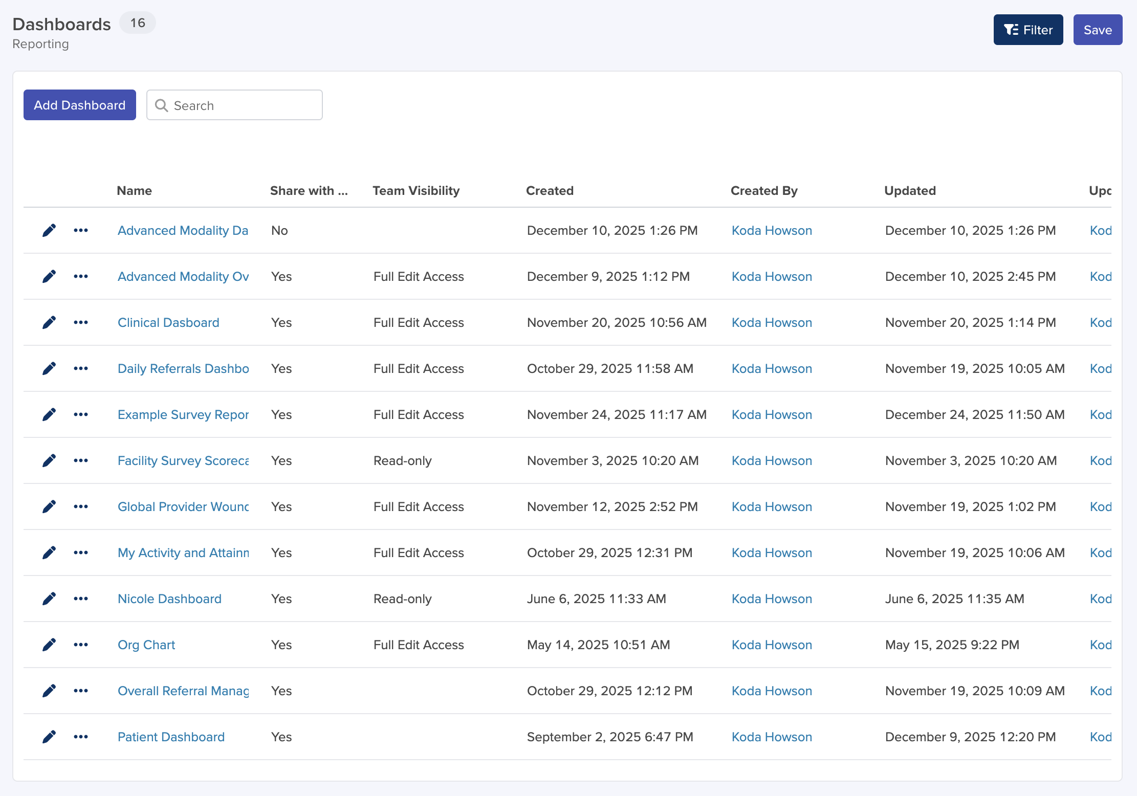
Dashboard List: The main area of the page displays a row for each dashboard. Each row shows the dashboard name, who created it, when it was last updated, and whether it is shared with the team.
Actions Menu (Three Dots): At the far-left end of each row you will see a three-dot menu icon. Clicking it reveals options to duplicate or delete the dashboard. Note that you can only edit or delete dashboards that you own, that are shared with Full Edit Access, or if you are an Admin.
Search and Filter: Use the search bar at the top of the list to quickly find a dashboard by name. You can also sort by column headers.
Creating a New Dashboard
To create a new dashboard, click the “Add Dashboard” button on the list page. A form will appear with the following fields:

Name
The Name field lets you give your dashboard a descriptive title. Choose something clear and informative – for example, “Sales Pipeline Dashboard” or “Customer Support Metrics”. This is a required field.
Share With Team
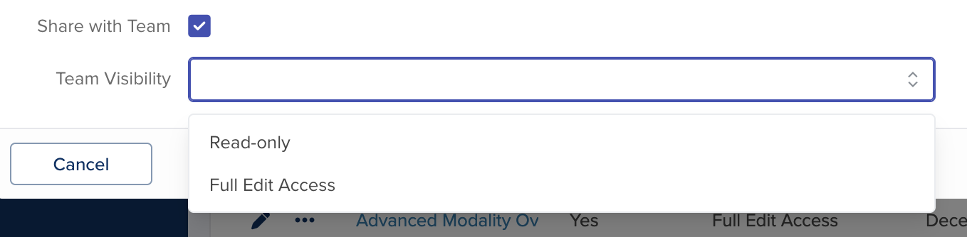
The Share with Team checkbox controls who can see and interact with your dashboard. By default, dashboards are private – only you can see them. If you check the Share with Team box, two additional options appear:
- Read-only: All team members can view the dashboard, but they cannot edit it. However, any team member can make a private duplicate (using Save As New) and customize their own copy without affecting the original.
- Full Edit Access: All team members can view and edit the dashboard. Changes made by any team member will be visible to everyone.
Hide Filters
The Hide Filters checkbox allows you to hide the filter pills that appear at the top of the dashboard when filters are applied. The filters remain active in the background even when the pills are hidden, keeping the dashboard view clean.
Save
Click the Save button to create the dashboard. You will be taken to the empty dashboard canvas, where you can start adding widgets.
The Dashboard Canvas
When you open a dashboard, you see the dashboard canvas – a free-form grid where your widgets live. At the top of the screen is the toolbar, which gives you access to all the actions you can perform on the dashboard.
Toolbar Overview
The toolbar at the top of the dashboard contains the following controls:
Add Widget (+ icon): Opens the widget creation modal so you can add a new widget to your dashboard.
Save Button: Saves all changes you have made to the dashboard (new widgets, moved widgets, edited settings). The Save Button also has a dropdown with additional options (see below).
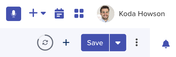
Refresh Icon: Manually refreshes the dashboard data. Only visible to Admin users. When auto-refresh is enabled, this icon becomes a countdown ring (explained below).
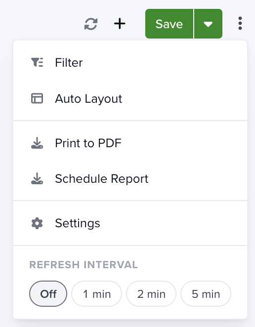
Overflow Menu: Opens a menu with additional options: Filter, Auto Layout, Print to PDF, Schedule Report, Settings, and Refresh Interval.
Adding Widgets to Your Dashboard
Widgets are the building blocks of your dashboard. Each widget displays a specific piece of information – a chart, a metric, a list of records, a calendar, and more. A dashboard can hold up to 100 widgets.
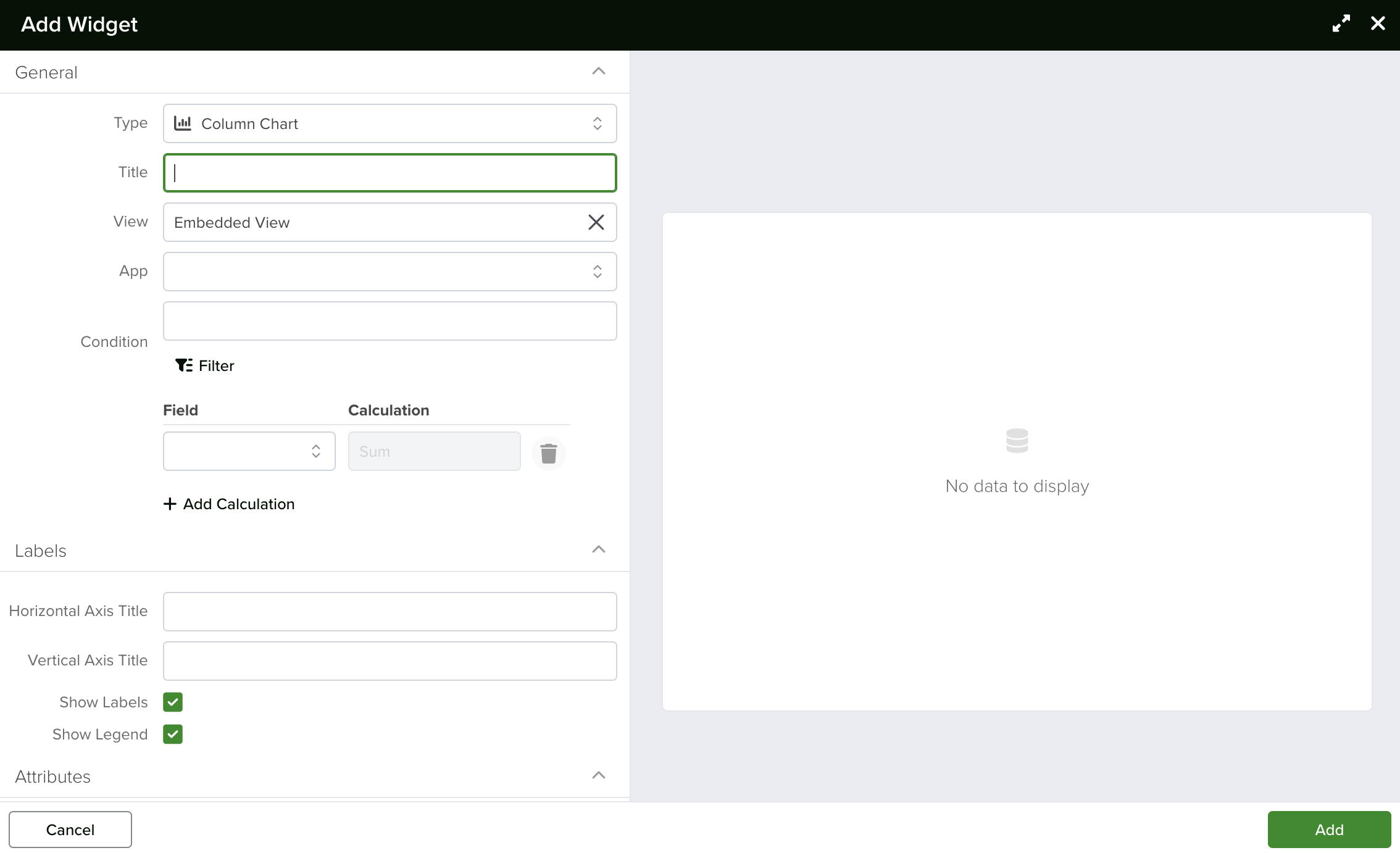
To add a widget, click the “+” (Add Widget) button in the toolbar. A large modal window will open, divided into two sections: the configuration form on the left and live preview on the right.
Note: Widgets make use of saved views. You may find it helpful to create a Saved View before building a widget. To learn more, check out the Views article.
Choosing a Widget Type
When the Add Widget modal opens, the first thing you do is choose a widget type. Widget types are organized into categories to help you find what you need quickly. A search bar is also available at the top to filter the list.
Charts & Visualizations
These widgets display your data as visual charts. You can choose from:
- Column Chart: Displays data as vertical bars. Great for comparing values across categories (e.g., deals by stage).
- Grouped Column Chart: Like Column Chart but with multiple series side by side. Useful for comparing groups within each category.
- Bar Chart: Displays data as horizontal bars. Works well when you have long category labels.
- Line Chart: Shows trends over time or across ordered categories with connected data points.
- Area Chart: Similar to a Line Chart but fills the area under the line. Good for visualizing volume or cumulative data.
- Pie Chart: Shows proportions of a whole as slices of a circle. Best for a small number of categories.
- Donut Chart: A Pie Chart with a hollow center. The empty center can display a summary metric.
- Waterfall Chart: Shows how an initial value is increased and decreased by a series of intermediate values. Useful for financial analysis.
- Funnel Chart: Displays stages in a process, showing how values decrease from one stage to the next. Ideal for sales pipelines or conversion funnels.
- Bubble Chart: Displays three dimensions of data: x-position, y-position, and bubble size.
- XY Scatter Chart: Plots individual data points on an x-y axis. Useful for identifying correlations between two variables.
Metrics & Indicators
These widgets highlight key numbers and performance indicators.
- Number: Displays a single, prominent number – such as total revenue, number of open deals, or average response time. The number auto-sizes to fill the available space. Supports comparison mode (showing the change from a previous period) and a progress bar.
- Multiple Number: Displays several key numbers side by side in a compact card layout.
- Gauge: Shows a single value on a semicircular dial with color ranges. You can customize the pointer, colors, and comparison.
- Stats: Displays a set of summary statistics in a compact grid format.
Data & Lists
These widgets show you records in various list and data layouts.
- List: Displays records in a tabular list view with columns you choose. Supports sorting, filtering, and grouping.
- Board: Displays records as cards organized into columns by stage or status.
- Calendar: Shows records with dates on a calendar layout. You choose which date field to use and can configure resources.
- Rolodex: Displays records as cards in a compact, contact-card style layout.
- Gantt: Shows records with start and end dates on a timeline (Gantt chart). Great for project management.
- Info Panel: Displays a detailed card view of a single record with custom field layouts.
- Text: A simple text widget where you can write notes, instructions, or descriptions directly on the dashboard.
Utilities & Tools
These widgets provide additional functionality and integrations.
- Global Search: Adds a search bar to the dashboard that lets users search across all apps.
- Google Maps: Displays records that have address fields on a map.
- HR Org Chart: Displays an interactive organization chart.
- Live Feed: Displays a real-time stream of changes happening in your workspace.
Configuring a Widget
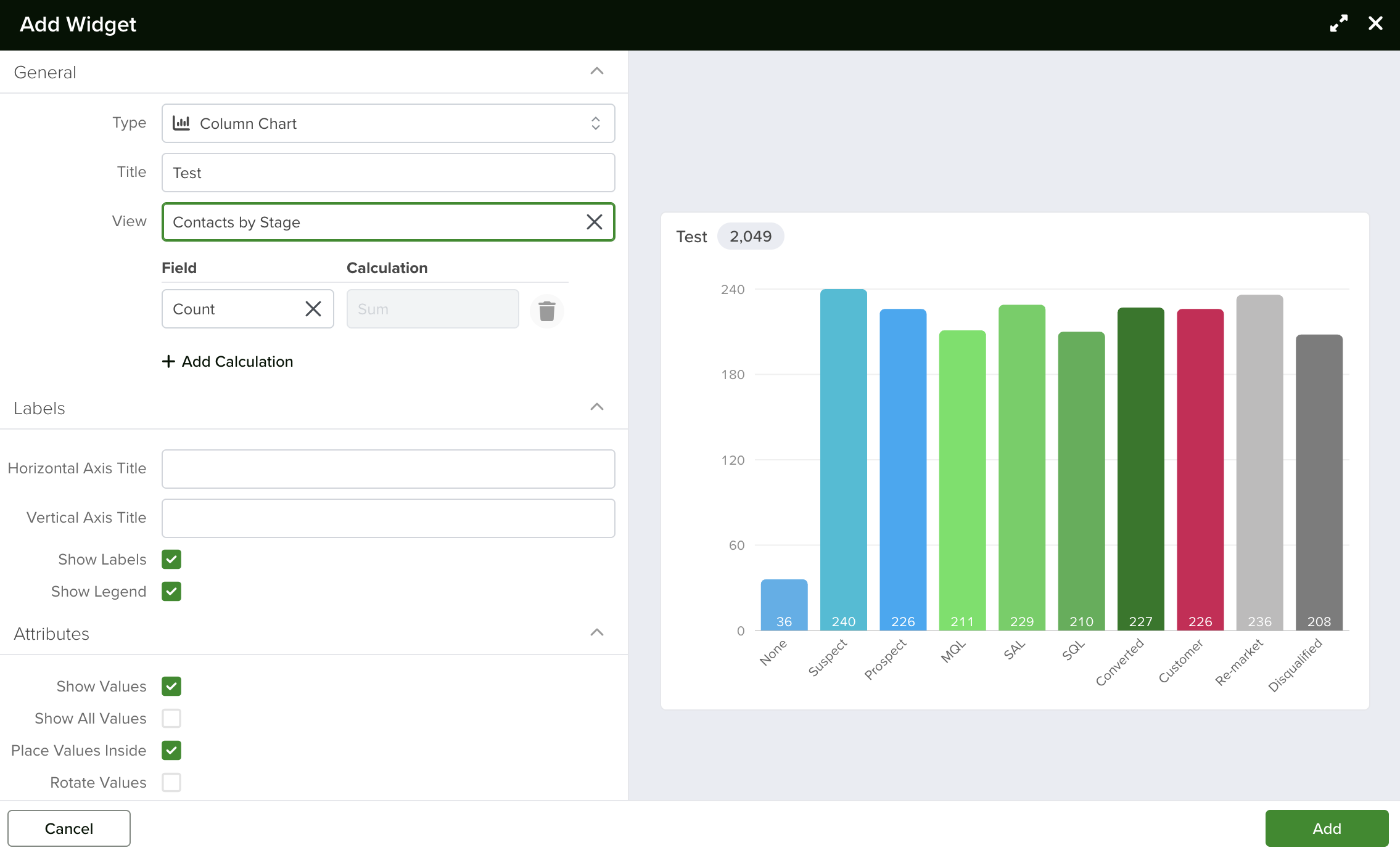
After choosing a widget type, you configure its settings using the form on the left side of the modal. As you fill in the settings, the preview on the right updates in real time, so you can see exactly what the widget will look like before you save it.
General Settings (All Widgets)
The following settings are common to most widget types:
- Title: Give your widget a clear, descriptive name. For example, “Deals by Stage” for a column chart showing deal counts per stage.
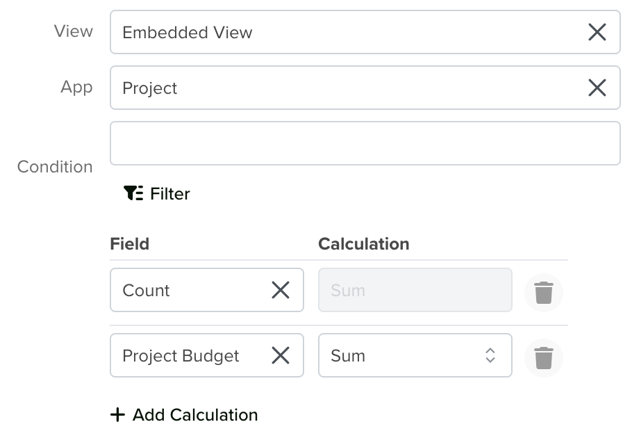
- View: Select the data source for the widget. You can choose a Saved View that you have already created, or select “Embedded View” to build a one-off view directly inside the widget without saving it separately.
Embedded View Options
When you select Embedded View, additional fields appear:
- App: Choose which app (e.g., Deals, Contacts, Tasks) provides the data for this widget.
- Condition (Filter, Sort, Group, Calculate): Define filters to narrow down which records appear, choose how to sort them, group them by a specific field, and set up aggregation calculations (such as Sum, Average, or Count). These tabs work the same way as when creating a Saved View.
Field and Calculation
Field: Choose which field the widget should use for its data. The available options depend on the app you selected. For example, if you chose the Deals app, you might select “Amount” to chart deal values.
Calculate: Choose how values are aggregated. Common options include:
- Sum: Adds up all values.
- Average: Calculates the mean of all values.
- Count: Counts the number of records.
- Min: Shows the smallest value.
- Max: Shows the largest value.
Note: Some chart types (Column, Line, Bar, Area) support multiple calculations at once. Click the “Add Calculation” button to stack a second field and calculation on the same chart.
Labels
The Labels section lets you customize the text labels on your widget. For chart widgets, you can label the horizontal axis, vertical axis, and choose whether labels are visible or hidden. Options vary depending on the widget type.
Attributes
The Attributes section controls how data elements are displayed. For example, on a bar chart you can choose whether to display the exact value on top of each bar, or on a gauge chart you can configure pointer style and colors.
Format
The Format section controls how numbers and values appear in the widget:
- Show Top N: Controls how many records are displayed. Enter a number (e.g., 5 shows the top 5). The default is 50. Leaving the field empty or entering 0 shows the top 50 records. The maximum is 100 – any number above that will be capped at 100.
- Default Format: Lets you override the default display format of the data. This is enabled by default.
- Number Prefix: Adds a prefix before numbers. Common prefixes include “$” for currency or “#” for numbering.
- Format Large Values: Simplifies large numbers for readability. For example, 14,000,000 becomes 14M.
Targets
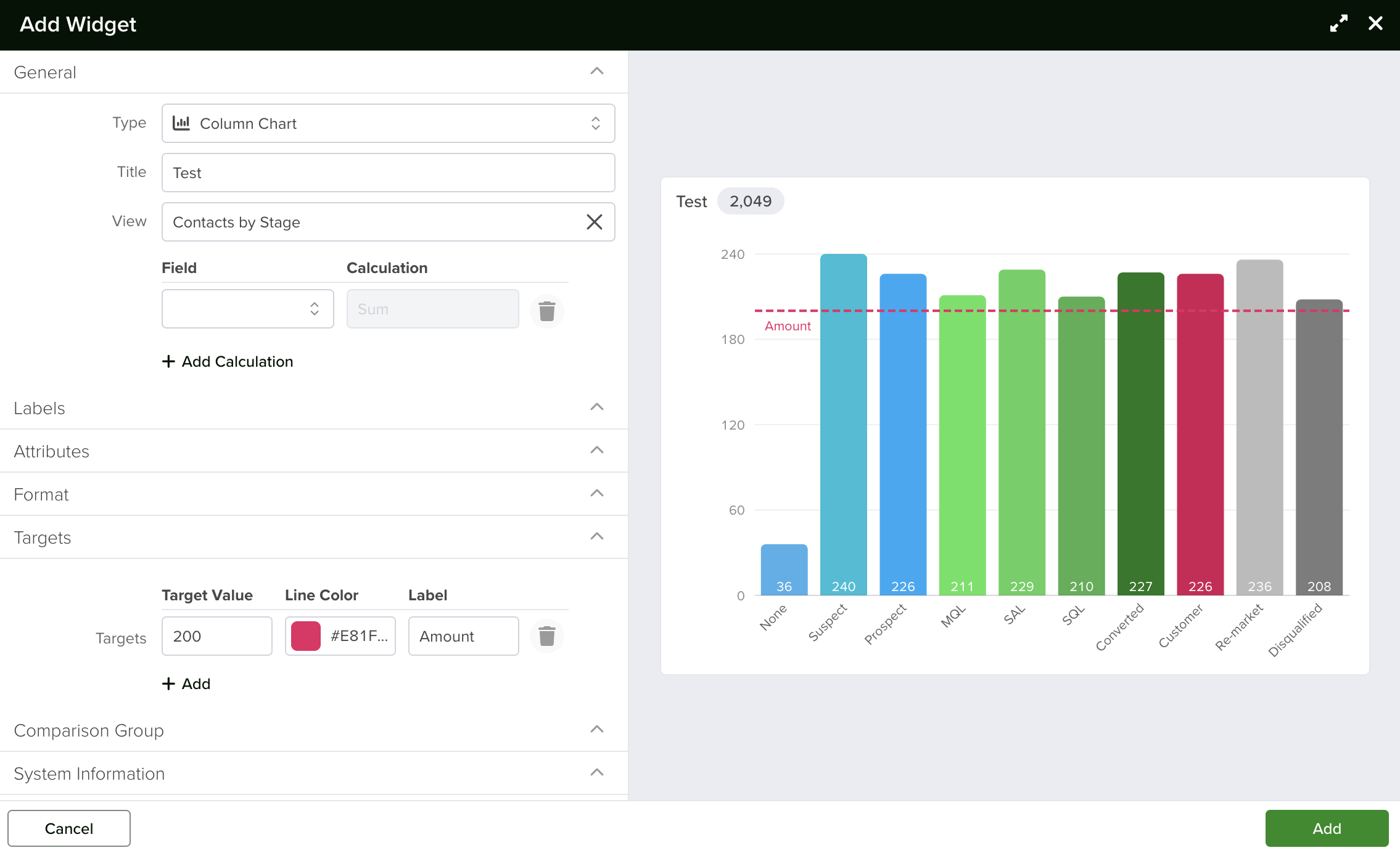
The Targets section lets you add visual target lines (or shaded zones) to chart widgets. This feature is available on Bar Charts, Column Charts, Line Charts, Area Charts, Funnel Charts, and Waterfall Charts.
You can add multiple targets to the same chart. This is useful for comparing actual performance against goals – for example, overlaying a quarterly sales target on a bar chart showing actual monthly sales.
Comparison
Many chart and metric widgets support a Comparison feature. When enabled, the widget shows both your current data and a comparison dataset side by side, making it easy to measure changes over time or across groups.
To use comparison:
- Check the “Enable Compare” checkbox in the widget settings.
- A comparison filter row will appear. Define the filter that identifies the comparison dataset – for example, records from the previous quarter, or records assigned to a different team.
- The widget preview will update to show both datasets.
The Number widget displays comparison as a delta – showing an arrow (up or down), the percentage change, and the absolute difference. Hover over the values to see the full, unabbreviated numbers.
Charts with comparison enabled show the comparison data as a second series in a different color, so you can easily spot the differences.
Progress Bar (Number Widget)
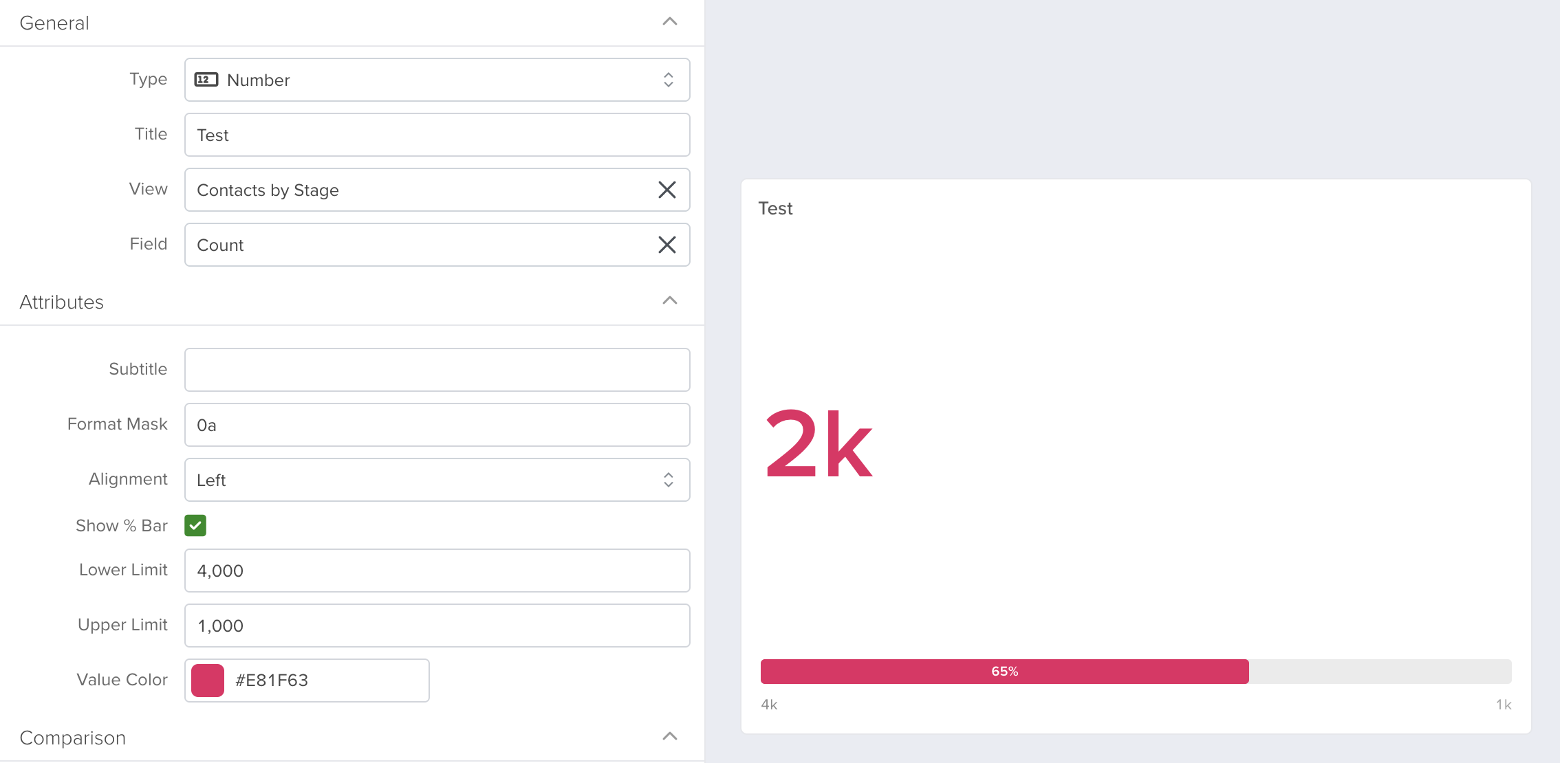
The Number widget can display a progress bar below the main value. To enable it, check the “Show % Bar” option and set a Lower Limit and Upper Limit. The progress bar fills proportionally based on where the current value falls between the lower and upper limits.
Borderless Option
Some widget types offer a “Borderless” checkbox. When enabled, the widget renders without a visible border or background, allowing it to blend seamlessly into the dashboard. This is especially useful for Text widgets where you want a clean, integrated look.
Aggregate Total Badge
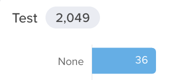
Bar, Column, Line, Waterfall, and other data charts display a small pill in the widget title bar showing the aggregate total across all visible data – for example, “12,450” or “1.2k.” Hover over the pill to see the full, unabbreviated number. This gives you a quick at-a-glance total without needing to add up individual bars or segments.
Rich Tooltips
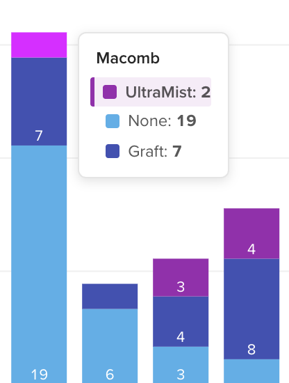
Hover over any bar, segment, or data point to see a rich tooltip with formatted values, series names, and comparison group data where applicable. Clicking a segment drills into the underlying records.
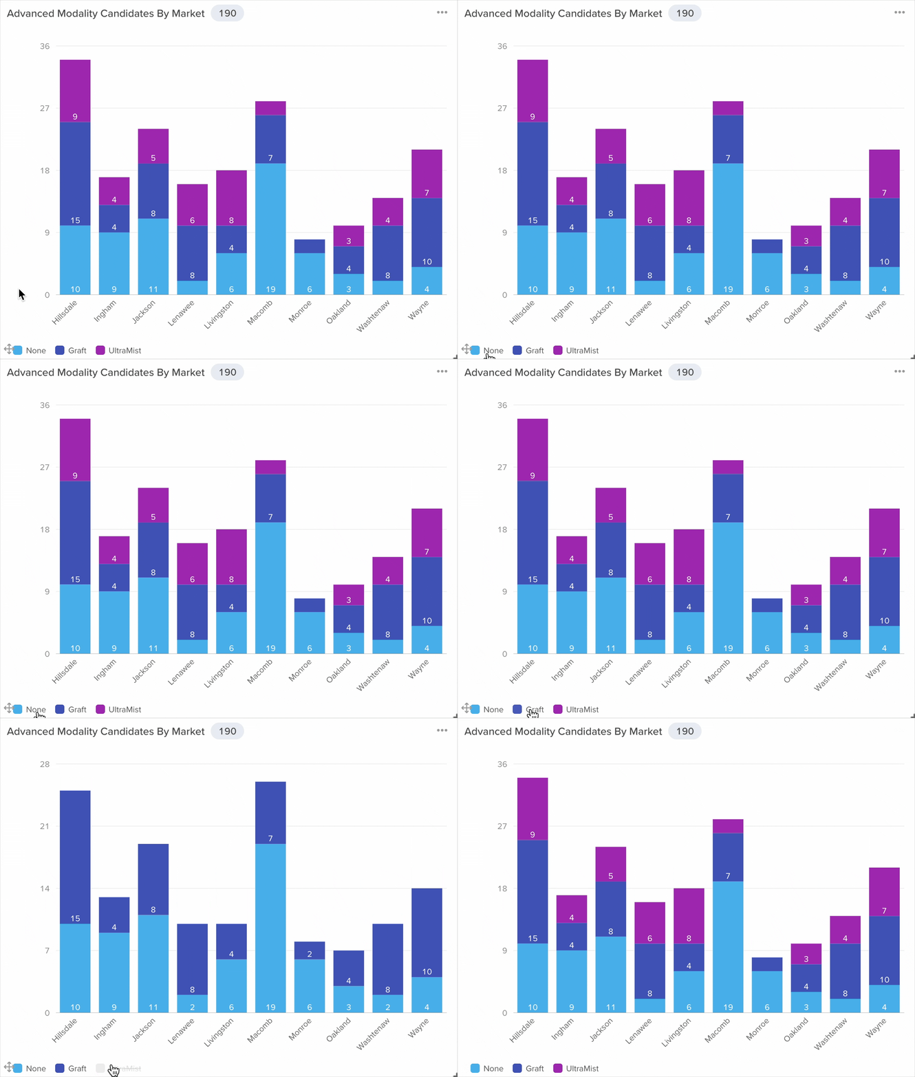
Interactive Legends
Clicking a legend item on Bar, Column, Line, Area, or Pie charts shows or hides that series. This is especially useful for dense multi-series charts where you want to focus on specific data series.
Organizing Widgets on Your Dashboard
One of the most powerful aspects of dashboards is that you have complete control over the layout. You are not locked into a fixed grid – you can place widgets wherever you want.
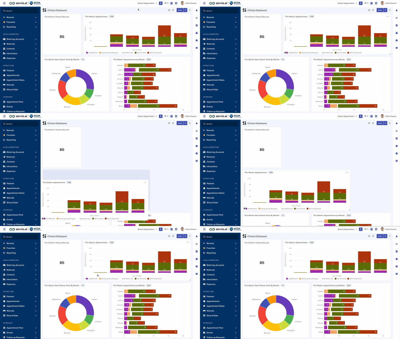
Moving Widgets
To move a widget, click and drag it by the drag handle at the bottom of the widget. As you drag, the other widgets automatically shift to make room. Drop the widget in its new position and the layout adjusts accordingly.
Resizing Widgets
Each widget has a resize handle in its bottom-right corner. Click and drag this handle to make the widget larger or smaller. Charts resize smoothly – during the resize operation, a lightweight placeholder is shown, and the chart repaints cleanly once you release the handle.
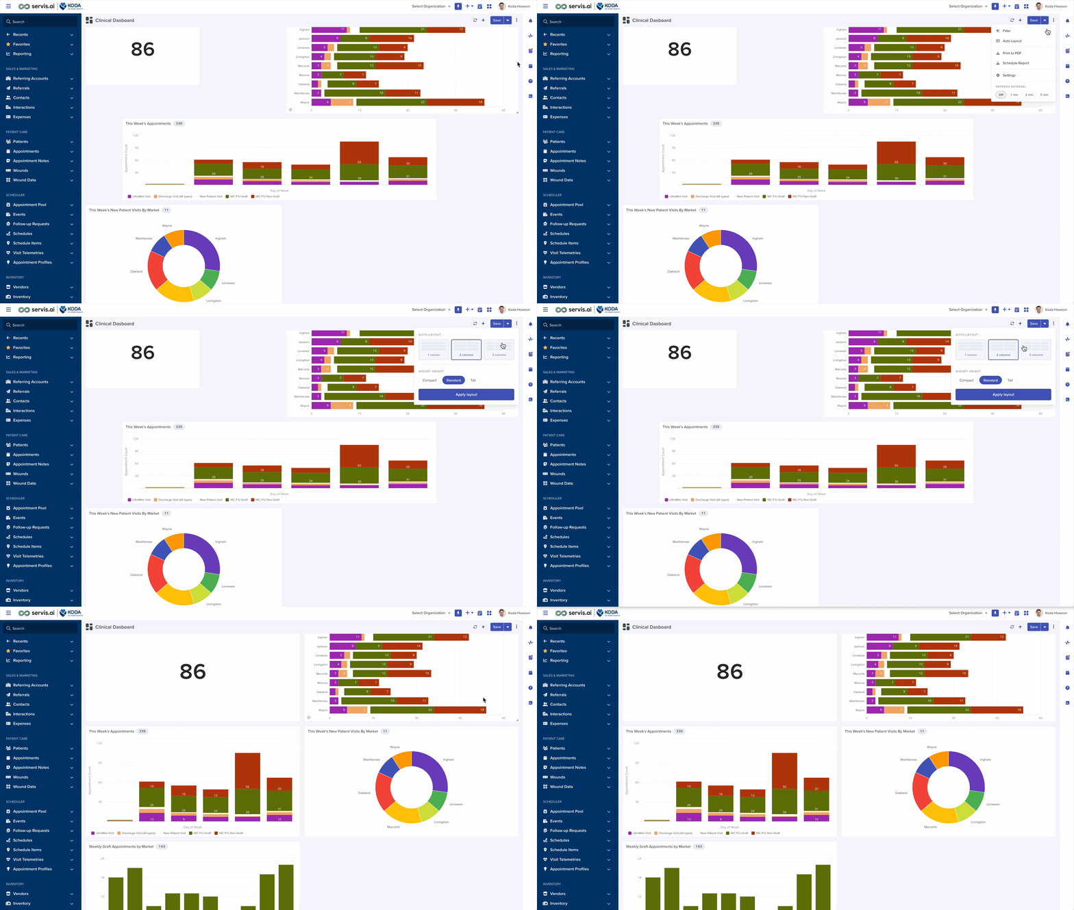
Auto Layout
If your dashboard has become cluttered or you want to quickly tidy things up, use the Auto Layout feature. Open the overflow menu (the ⋮ button) in the toolbar and select “Auto Layout”. A panel appears with the following options:
- Columns: Choose 1, 2, or 3 columns. A visual thumbnail preview shows what each option looks like so you can decide at a glance.
- Widget Height: Choose Compact, Standard, or Tall to control how tall each widget becomes in the reflowed layout.
Click “Apply Layout” and all widgets are instantly reorganized into a clean, uniform grid. The auto layout preserves the visual reading order of your widgets (top to bottom, left to right).
Widget Options Menu
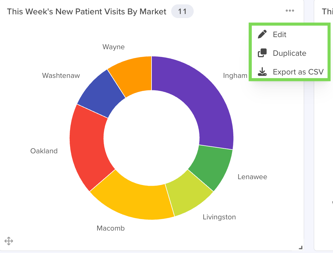
Hover over any widget on your dashboard to see a three-dot menu icon in the top-right corner of the widget. Click it to open the options menu with the following choices:
- Edit: Opens the widget configuration modal so you can change the widget type, data source, display settings, or any other property.
- Duplicate: Creates an exact copy of the widget and places it on the same dashboard. This is useful when you want to create a similar widget with minor differences – duplicate the original and then edit the copy.
- Export as CSV: Exports the widget’s underlying data as a CSV file. You can then open it in a spreadsheet application for further analysis.
Refreshing Dashboard Data
Note: The refresh feature is available exclusively to users with Admin permissions.
Manual Refresh
Click the refresh icon (↻) in the toolbar to immediately reload all widget data from the server. This is useful when you know data has changed, and you want to see the latest numbers right away.
Automatic Refresh
You can set your dashboard to automatically refresh at regular intervals, so it always shows the most recent data – perfect for dashboards displayed on a wall monitor or used during live events.
To set up auto-refresh, open the overflow menu (⋮) and look for the “Refresh interval” section.
Choose one of the following options:
- Off: Disables automatic refresh. You must refresh manually.
- 1 min: Refreshes every 1 minute
- 2 min: Refreshes every 2 minutes.
- 5 min: Refreshes every 5 minutes.
Your refresh preference is saved per dashboard and persists across sessions.
Auto-Refresh Countdown Ring
When auto-refresh is enabled, the refresh icon in the toolbar transforms into a live countdown ring – a small circular progress indicator that depletes over the refresh interval. This gives you a visual sense of when the next refresh will occur.
You can interact with the countdown ring:
- Click it to refresh immediately and restart the countdown.
Note: The automatic refresh timer continues to run as long as you remain on the dashboard page. Navigating away stops the timer.
Filtering the Entire Dashboard
You can apply filters that affect every widget on the dashboard at once. This is extremely useful when you want to see a specific slice of your data across all widgets – for example, filtering all widgets to show only data from the current quarter or from a specific region.
To apply dashboard-wide filters:
- Open the overflow menu (the ⋮ button) in the toolbar.
- Select “Filter.” A filter panel will appear.
- Choose the app and define your filter conditions – for example, “Close Date is within this quarter” or “Region equals West.”
- Click the submit button to apply the filters. All widgets on the dashboard will update to reflect the filtered data.
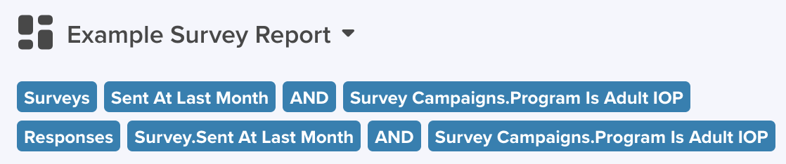
When filters are active, filter pills appear in a bar just below the dashboard title. Each pill shows the app name and the active filter conditions. You can remove individual filters by clicking the “x” on any pill.
Saving and Discarding Changes
After making changes to your dashboard – adding, editing, moving, or deleting widgets – you need to save those changes. The toolbar provides the following save options:
- Save: Click the Save button to save all changes to the current dashboard. The button appears highlighted when there are unsaved changes.
- Save As New: Available from the dropdown arrow next to the Save button. Creates a copy of the dashboard with a new name. Your original dashboard remains unchanged. This is useful when you want to experiment with a different layout without risking your current setup.
- Discard Changes: Also available from the Save dropdown. Undoes all unsaved changes and reverts the dashboard to the last saved version.
Unsaved Changes Warning
If you attempt to navigate away from a dashboard that has unsaved changes, servis.ai will warn you with a dialog that gives you the choice to:
- Save the changes before leaving.
- Discard the changes and leave without saving.
- Stay on the current dashboard (cancel the navigation).
The dialog also includes a “Don’t show this warning again” checkbox if you prefer to skip the warning in the future.
Note: If you are viewing a shared dashboard with Read-only access and you make changes, servis.ai will prompt you to save a copy rather than modify the original.
Dashboard Settings
Open the overflow menu (⋮) and select “Settings” to edit the dashboard’s name, sharing options, hide filters toggle, and primary app. The settings modal shows the same fields as the Create Dashboard form, plus an additional “Primary App” field that lets you associate the dashboard with a specific app for context.
Note: You must be the dashboard owner or have Admin permissions to access Settings.
Printing to PDF
You can export your entire dashboard as a PDF document – perfect for archiving, sharing via email, or including in reports.
To print your dashboard to PDF:
- Open the overflow menu (⋮) in the toolbar.
- Select “Print to PDF.”
- Servis.ai will generate the PDF in the background. When it is ready, you will receive a notification.
- Click the notification or the download link to save the PDF file to your computer.
The PDF captures the full dashboard layout, including all widgets, at their current sizes. The layout is optimized for PDF output to ensure clean rendering.

Scheduling Reports
Note: Schedule Report is available only to users with Admin permissions.
Instead of manually exporting a PDF every time you need an update, you can schedule servis.ai to generate and deliver the report automatically on a recurring basis.
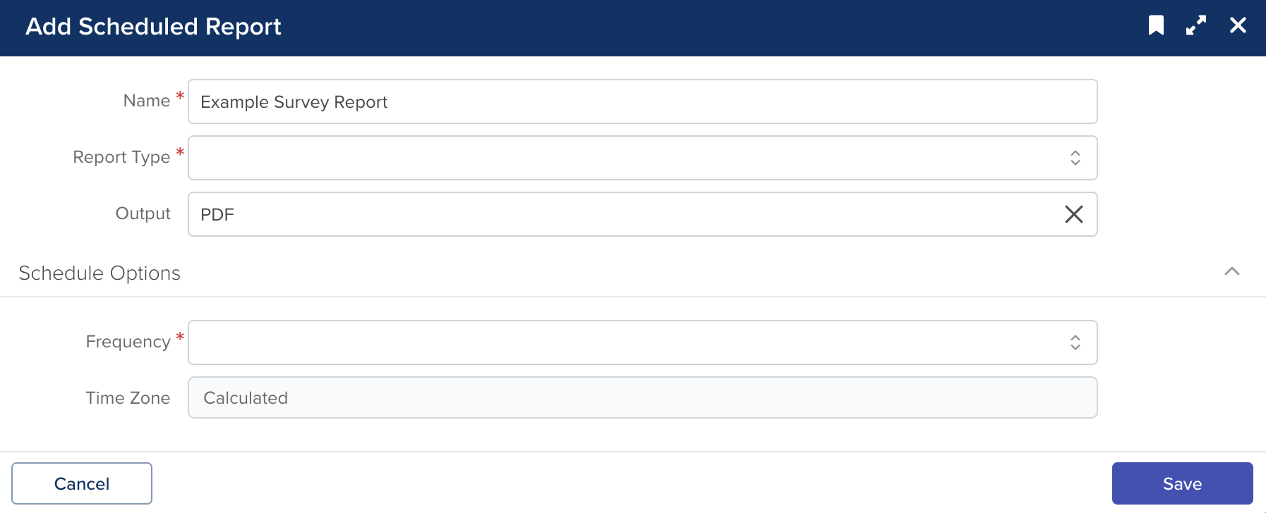
To schedule a report:
- Open the overflow menu (⋮) in the toolbar.
- Select the “Schedule Report.” The Add Scheduled Report form appears.
- Fill in the following details:
- Report Name: Give the scheduled report a descriptive name.
- Delivery Method: Choose whether to send the report via email.
- Recipients: Specify who should receive the report.
- Frequency: Set how often the report should be generated (e.g., daily, weekly, monthly).
- Time: Set the time of day the report should be generated and sent.
- Save the scheduled report. Servis.ai will now generate and deliver the PDF automatically at the times you specified.
To learn more about scheduling reports, check out the Scheduled Reports article.
Dashboard Alert Messages
Your servis.ai account may be configured to display alert message banners on dashboards. These are informational messages that appear at the top of the dashboard – for example, announcements about scheduled maintenance, tips about new features, or important notices.
Alert messages are displayed as a yellow banner. If you dismiss an alert by clicking the close button, it will not reappear for the rest of the day. The next day, if the message is still active, it will appear again.
Note: Alert messages are hidden during Print to PDF so they do not appear in your exported reports.
Adding a Dashboard to the Navigation Menu
Note: This feature is available only to Admin users for dashboards that are shared with the team and have a Primary App set.
If you want quick access to a dashboard without navigating through the Reporting section, you can add it directly to the servis.ai sidebar navigation menu. When added, the dashboard appears as a menu item under its associated app.
To add or remove a dashboard from the menu:
- Open the dashboard and click the dropdown arrow next to the Save button.
- Look for the “Add to Menu” option (or “Remove from Menu” if it is already added).
- Click it to toggle the dashboard’s visibility in the navigation menu.
Deleting a Dashboard
To delete a dashboard, you can do so from the Dashboards list page. Open the three-dot menu on the dashboard row and select “Delete”. A confirmation dialog will appear to make sure you want to proceed. Once confirmed, the dashboard and all its widgets are permanently removed.
Note: You can only delete dashboards that you own, that are shared with Full Edit Access, or if you are an Admin.
Best Practices
- Start with a clear purpose. Before adding widgets, ask yourself: “What question should this dashboard answer?” Then choose widgets that directly address that question.
- Use Saved Views. Creating a Saved View before building widgets gives you more control over filters and sorts, and makes your widgets easier to update later.
- Mix widget types. Combine charts (for trends), Number widgets (for KPIs), and List widgets (for detail) on the same dashboard to give a complete picture.
- Use the live preview. As you configure a widget, watch the preview panel on the right. It updates in real time, so you can fine-tune settings before committing.
- Take advantage of Auto Layout. If your dashboard has many widgets, Auto Layout (1, 2, or 3 columns) quickly tidies everything into a professional grid.
- Schedule recurring reports. Instead of manually exporting PDFs every week, set up a Schedule Report to have servis.ai deliver them automatically.
- Use comparison to show progress. Enable comparison on charts and Number widgets to highlight how current performance compares to a previous period or benchmark.
- Share with the right access level. Use Read-only sharing when you want your team to see the dashboard but not accidentally change it. Use Full Edit Access for collaborative dashboards.
- Keep it focused. A dashboard with too many widgets can be overwhelming. Consider creating separate dashboards for different audiences (e.g., “Sales Manager Dashboard” vs. “Sales Rep Dashboard”).