This data visualization is commonly used to compare values easily since each column is close to the next, allowing you to see which column has the highest or lowest value of the group.
Usage Example
You can use it to create a Leaderboard for most calls made each month. If your company has an established target for the number of calls each rep needs to make, you can add a target in order to see if they have reached it yet.
There are three different Column Chars to choose from.
Column Chart

Grouped Column Chart

Column Chart by Record

For the most part, the settings for all three of these charts are the same. There are a few small differences for each that we’ll highlight.

1. View
Select the view you want to use as the base for your widget. You can use a saved view or select “Embedded View” and create a new one for this widget.
2. App
Choose the application you would like to use for the data for the widget.
3. Filter
You can adjust the filters from a previously saved view or add filters just for this widget.
For more information on filters, see the following article:
4. Field
Defaults to Count. If a field is selected, then a new field called calculation will appear; you can choose between sum, average, max, and min.
Note: the Field attribute changes to Plot Fields when the Column Chart by Record is selected.

5. Labels
Horizontal Axis Title: add a title to the horizontal axis.
Vertical Axis Title: add a title to the vertical axis.
Show Labels: When enabled, it will show the name of the data in the Vertical Axis.
Label Display:
- Auto fits in the labels automatically.
- Wrap adjusts the text in two or more lines when there is not enough space to display it in a single line.
- Stagger interleaves the values one up and one down for a better fit in a single line.
- Rotate. 90º rotation of the labels.
Show Legend: When enabled includes the color code with values of the field used to group the data. It is displayed at the bottom of the widget.
6. Attributes
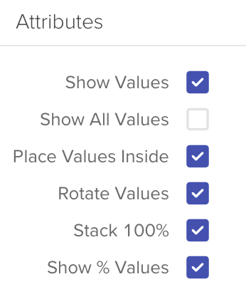
Show Values: When enabled, it shows the total number of days inside each section of the widget, and not just on hover over.
Show All Values: This will display all values associated with the filters you’ve chosen. Including zeros.
Place Values Inside: places all values inside the bars.
Rotate Values: 90º rotation of the column values. Requires Show Values.
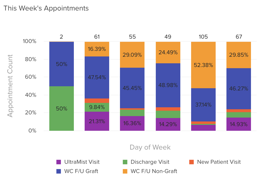
Stack 100%: When enabled, it transforms the horizontal axis values to percentages and presents the values in the corresponding proportions of 100%
Show % Values: Shows the % instead of the actual count in the widget’s context.
Note: the Stack attribute is not available for the Grouped Column Chart.
7. Format
Show Top N: If you enter the number 5, the chart will display the top 5 records based on the filters you chose earlier.
Default Format: When disabled, override the default format.
Number Prefix: Add a prefix to the numbers in the widget, from letters to symbols.
Format Large Values: When enabled, it will apply the required format to simplify the quantities, for example, it will transform 14,000,000 to 14M
8. Targets
Target Value: Assign the target value that will be identifiable in the chart as a line.
Line Color: Use the color picker to assign a color to the line.
Label: Optional. If empty, it will show the target value.
