You can learn how to create a new Form Field from this article.
This field type is ideal for scenarios where the information has only two possible values, such as Yes/No, Done/Not Done, or Submitted/Unsubmitted.
- The values can be customized to fit specific needs.
- Icons and colors can be assigned to each value for better visual distinction.
- A default value can be set to streamline data entry.
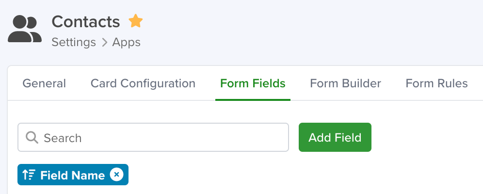
Navigating to Form Fields
Go to Settings > Apps, select the app you’d like to add the field to and select the ‘Form Fields’ tab.
Configuring a Checkbox Field
To set up a Checkbox field in your app, follow these steps:
- Add a New Field: Click the Add Field button to open the Field Type selection window.
- Select Image Field Type: From the list of available field types, choose the Checkbox option.
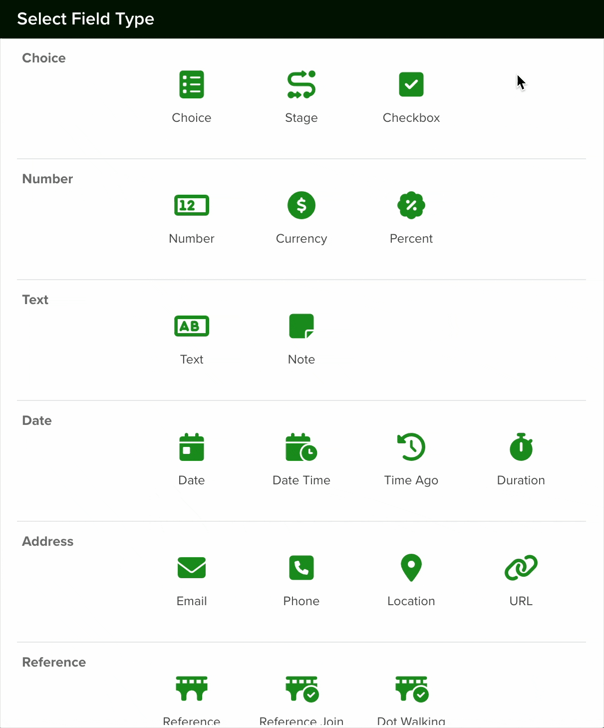
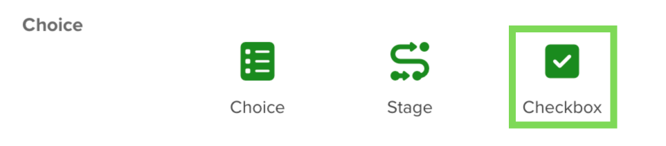
- Configure the Field: After selecting the Checkbox field, proceed with the configuration settings as needed.
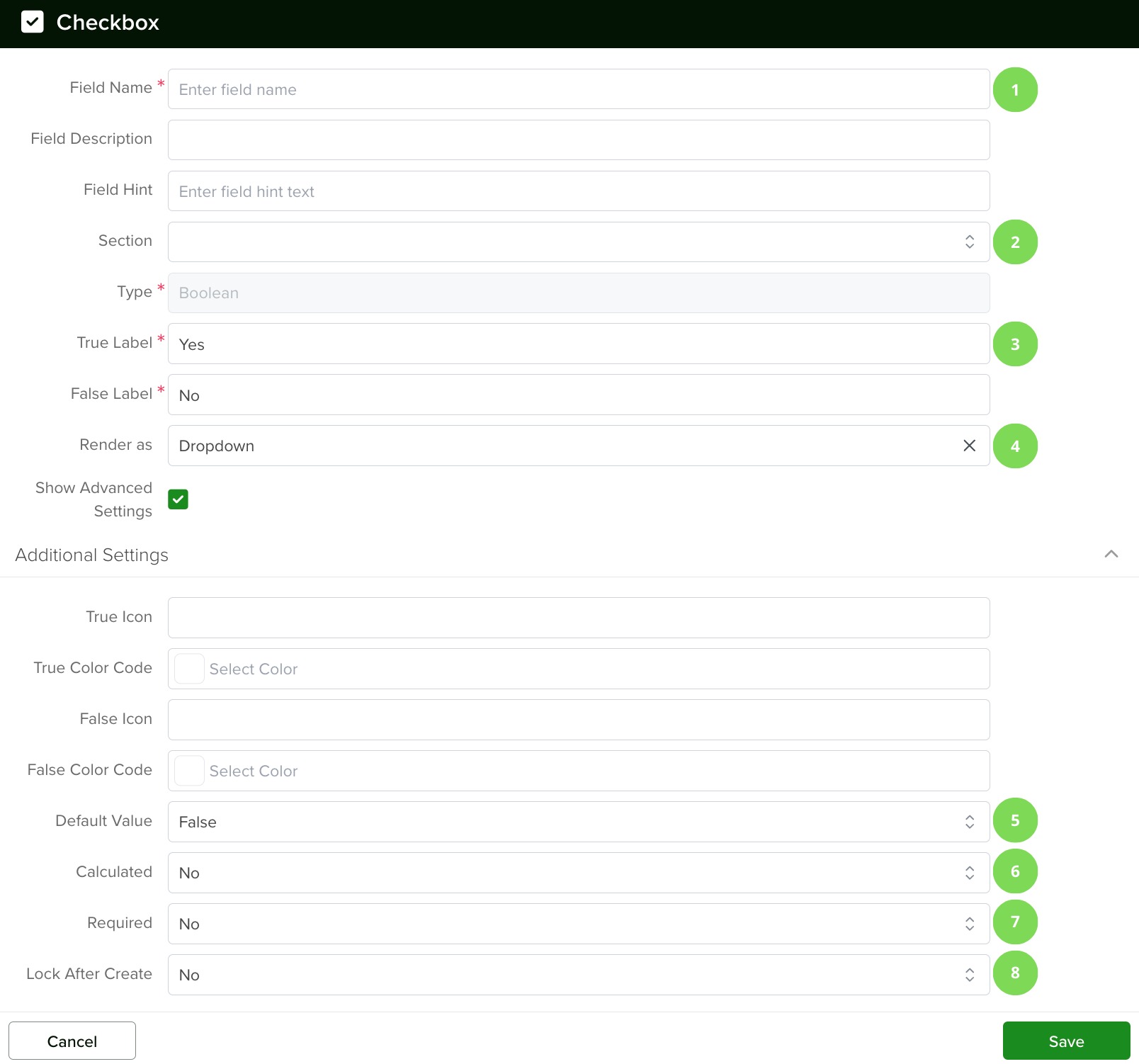
1. Field Name
Give your field a name and add a field hint if desired.
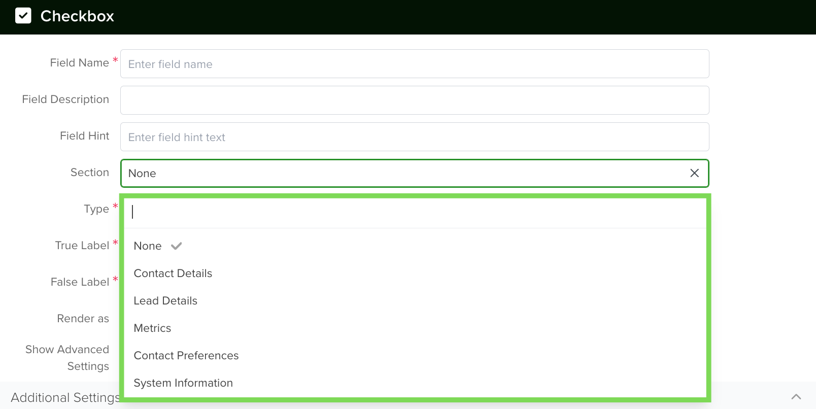
2. Section
You can then select the section (from the Form Builder tab) in which the field will be created or keep the default option.
3. True and False Labels
To set up a field with two possible values, such as Yes/No or Done/Not Done:
- Define Values: Specify what each state represents. For example, “Yes” for a completed task and “No” for an incomplete one (default value).
- Customize Appearance: Assign distinct icons and colors to each value to enhance clarity.
- Set Default: Choose a default value to streamline data entry.
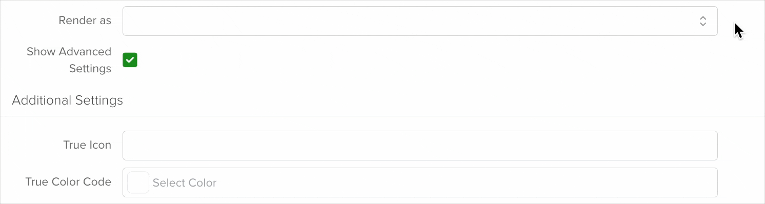
4. Render as
When configuring the display of a field with two possible values, you have three rendering options:
Dropdown: A collapsible list where users select one option like the one your are selecting it from.
Checkbox: A box that users can check or uncheck.

Pills: Button-like elements that toggle on or off when clicked.
To access additional configuration options, enable the “Show Advanced Settings” checkbox. This will reveal more settings for further customization.
5. Default Value
When setting up a field with two options, it’s advisable to pre-select a default value.
This default appears automatically when creating a new record, streamlining data entry. Typically, the ‘false’ value is recommended as the default, indicating the initial state before any action is taken.
For instance, in a task management system, ‘Task not completed’ would be set to ‘No’ by default. Additionally, you can enhance clarity by assigning specific icons and colors to each value.
Note: This option becomes unavailable when the ‘Calculated’ checkbox is enabled.
Note: It’s expected behavior for Checkbox fields to require a value, meaning either true or false must be present, and it’s not possible to remove the default value for this type of field.
6. Calculated
Checkbox fields can also be calculated. Just enable the ‘Calculated’ checkbox and add your custom code in the space available for it. If you want to learn more about it, check this article.
7. Required
If you enable the ‘required’ checkbox, every time a team member creates a new record, they will need to input the information for this field in order to save it.
8. Lock After Create
If you enable the ‘Lock After Create’ as its name implies, the field will be locked once the new record is saved and the value of the field will not be editable afterward.
Once you are done setting your field, click the save button.
Note: All new fields are added at the bottom of the form.
Changing a Field’s Type
In servis.ai, once a field is created, its type (e.g., text, number, date, boolean) cannot be modified directly. This limitation helps ensure data consistency and prevents errors that could arise from incompatible data formats.
If you need to change the type of an existing field, you’ll need to follow these steps:
- Create a New Field: Go to the Form Fields tab on your App’s Settings and create a new field with the desired type (for example, switching from a text field to a number field).
- Deactivate the Old Field: Once the transition is complete, you can choose to delete the original field or simply hide it from views to avoid confusion.
