Card Configuration
Cards are a great way to get relevant information in a single place, and we know that what is important might be different for each business, which is why you can change the information that appears on the Cards.
Edition Qualifier: This feature is available in all servis.ai Editions.
User Permissions: Only administrators can update the Card configuration.
What is a Card?
Cards are essentially small summaries for a record in any of your Apps. A card can be customized to show you the most relevant information you need at a glance. Let’s explore where they will appear and how to set them up to suit your specific needs.
Where Are Cards Used?
Your card configuration will show in every view where Cards can be found. The Rolodex & Board Views are perfect examples; you will also notice the Cards in the Related List on the right side of the screen and in the mobile app.
Cards are smart, as they will adjust their size to include only the information available for each one of your Records. And the best part of it all is that they look the same across all your views in the system.
Customize your Card
When you need to see different pieces of information per App, your best option is to customize a Card.
Go to Settings > Apps > (App Name) > Card Configuration
You can customize the display by switching the currently shown fields with any available options. Here’s what you can do:
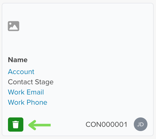
- Cover Image: Add a cover image and choose to display it as a Thumbnail or in Landscape view.
- Card Body: Select the most important fields to highlight in the main section.
- Card Footer: Decide if you want to show additional details at the bottom of the card.
When you add, edit, or delete fields, the card preview updates instantly, reflecting your current setup in real time.
Want more insights? Use dynamic fields like “# of Interactions” to display data that adapts to your needs based on the app you’re working with.
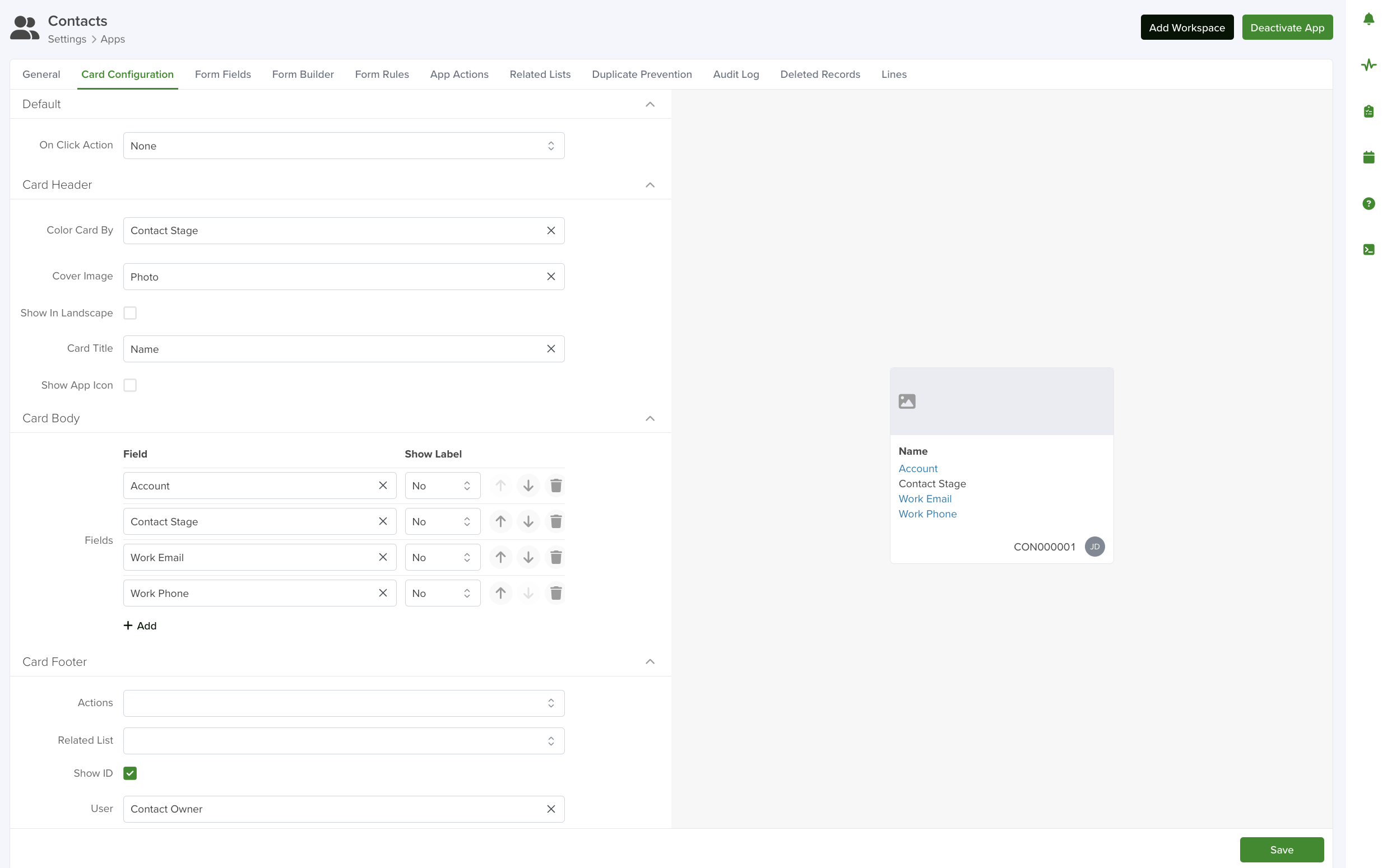
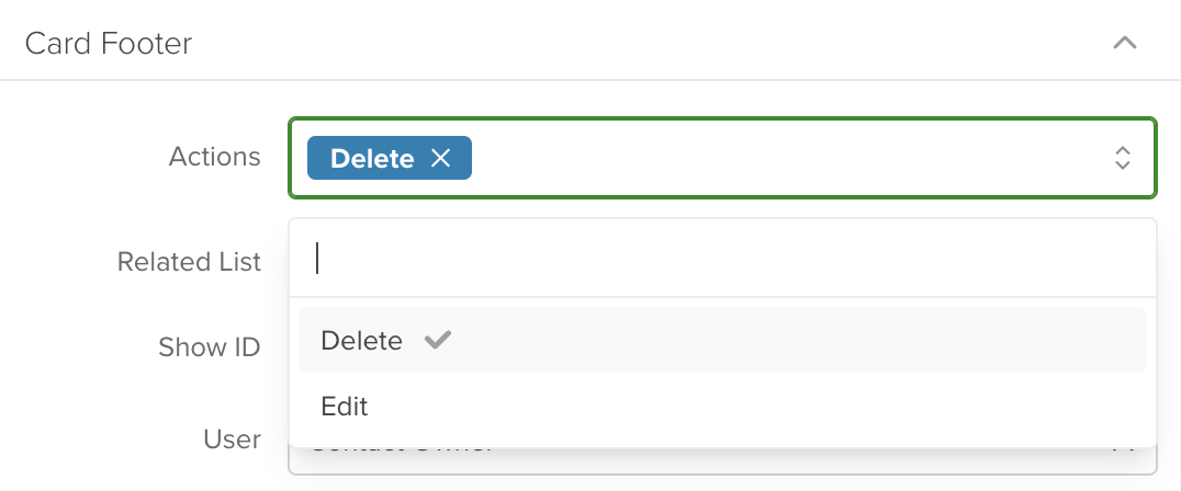
You can enhance your cards by adding Actions, allowing team members to perform tasks with a single click.
For example, if you set ‘Delete’ as the Action, a delete icon will appear on the card, making it easy for users to remove records instantly.
Once you’ve selected your fields and configured the card, click ‘Save’ to apply your changes.
Choice Lists
Choice Lists make it easy to customize your servis.ai account by allowing you to create reusable lists for different fields across all your apps.
For example, you can create a Choice List with all 50 U.S. states and then use it to:
•Add a State field in your Contacts App.
•Use the same State field in your Organizations App.
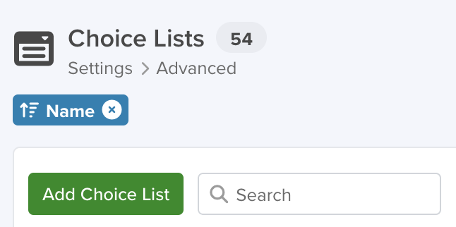
Go to Settings > Advanced > Choice Lists.
Create a Choice List
To create a Choice List, click the ‘Add Choice List’ button.
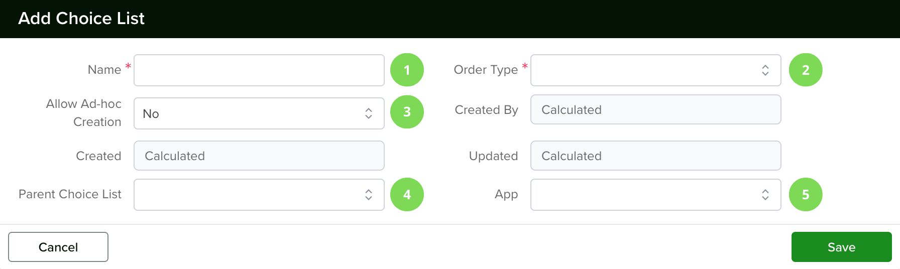
1. Name
On the Creation window, the first thing you need to do is give your Choice List a Name.
2. Order Type
Then you need to select the Order Type from the two options available: Alphabetical or Order. The Order you select here will have an effect on the ‘Sorting’ functionality for your Choice List in the List View. You will have the option to change their order at any time, using our drag & drop feature, by clicking the ‘Reorder’ button.
- Alphabetical: For this Order Type, the system will automatically order your Choices from ‘A to Z’. The will be applied to the column sort, the first click on the column’s name will sort from ‘A to Z’, while the second click will sort from ‘Z to A’.
- Order: For this Order Type, each of the elements in your list will have an order number defined by the time they were created. If you used the Bulk option, they will have the order in which you added or copied & pasted your values.
3. Allow Ad-Hoc Creation
Next, define if you want to ‘Allow Ad-hoc Creation’ or not. If selected, it will allow anyone on your team to create additional Choices for your List on the form. If you don’t select it, only the available Choices will be displayed.
Note: Please note that the ‘Allow Ad-hoc Creation’ option is only available when the ‘Order Type’ is set to Alphabetical.
4. Parent Choice List
You only need to make a selection here if the choice list you’re creating is meant to be a child list attached to a parent. See Create Child Choice List on how to do this.
5. App
Select the application you would like to use your choice list within.
Note: Please note that the ‘Allow Ad-hoc Creation’ option is only available when the ‘Order Type’ is set to Alphabetical.
Now let’s create our choices. There are two different creation methods:
Create Choices One at a Time
You can use this option to create a small list or add more choices to an existing Choice List.
- Click the pencil icon next to the name of your created list to open your Choice List.
- Click the ‘+ Add’ button to add a new choice.
- In the creation window, type the name of your new choice.
- Click ‘Save’ to confirm your changes.
This makes it easy to expand your lists one choice at a time.
Create Choices in Bulk
This is the best option when creating a Choice List for the first time, as it allows you to add multiple choices at once.
- Click the ‘Add Bulk’ button to get started.
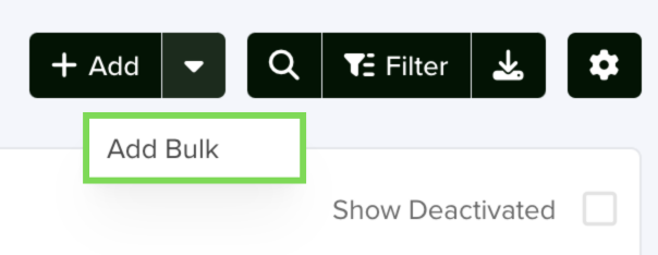
- Type your choices manually or copy & paste them from another source, like an Excel spreadsheet.
- Once you’re ready, click ‘Save’, and all your choices will be created instantly.
This method saves time and ensures your list is set up quickly.
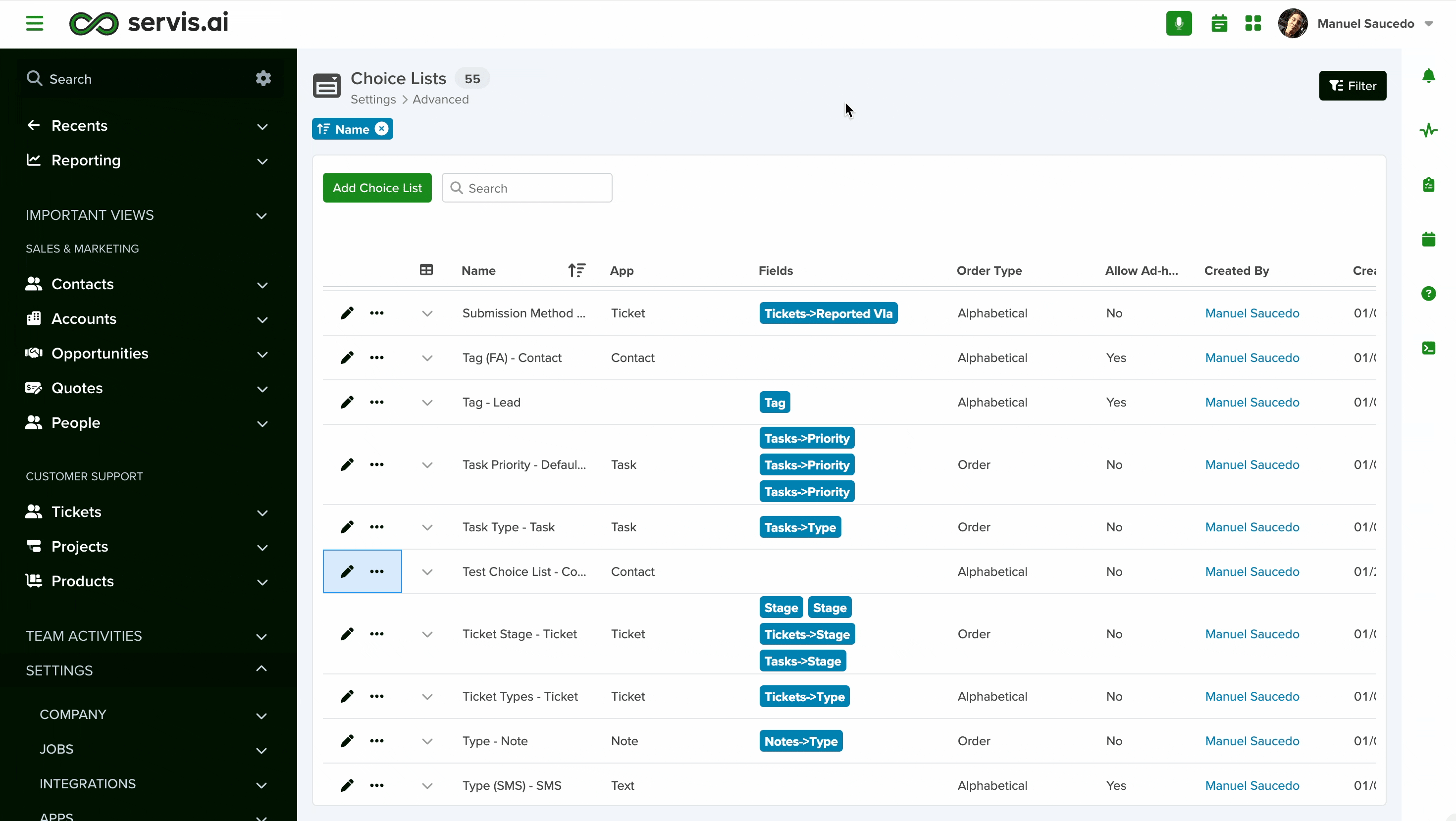
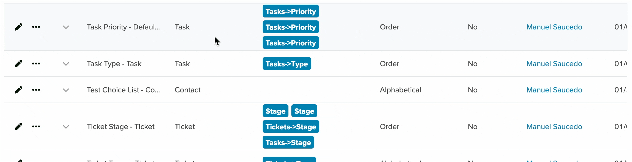
Choice List Details
To see the choices on your List without the need to edit them, click the down arrow right next to the name. It will expand your Choice List and show you all the existing Choices.
Create a Child Choice List
To set up a Child Choice List, follow these steps:
- Name Your Choice List
- Enter a name for your new Choice List.
- Select the order type (Ordered or Alphabetical).
- If you want team members to add choices on the fly, set ‘Allow Ad-hoc Creation’ to ‘Yes’.
- Select the Parent Choice List
- Choose the Parent Choice List to which you’ll add sub-choices.
- For example, this allows users to select Sub-Industries based on an Industry choice within the same form.
- Add Sub-Choices
- Click the ‘Add New’ button.
- In the creation window:
- Enter the name of the sub-choice.
- Add a value if using an integration that requires a specific ID or name.
- (Optional) Add an icon and choose a color.
- Select the Parent Choice from the dropdown (this is automatically populated based on the Choice List you selected).
- Click ‘Save’ and repeat the process for all sub-choices.
Once completed, your Child Choice List will be ready to use.
Delete, Deactivate, or Edit a Choice
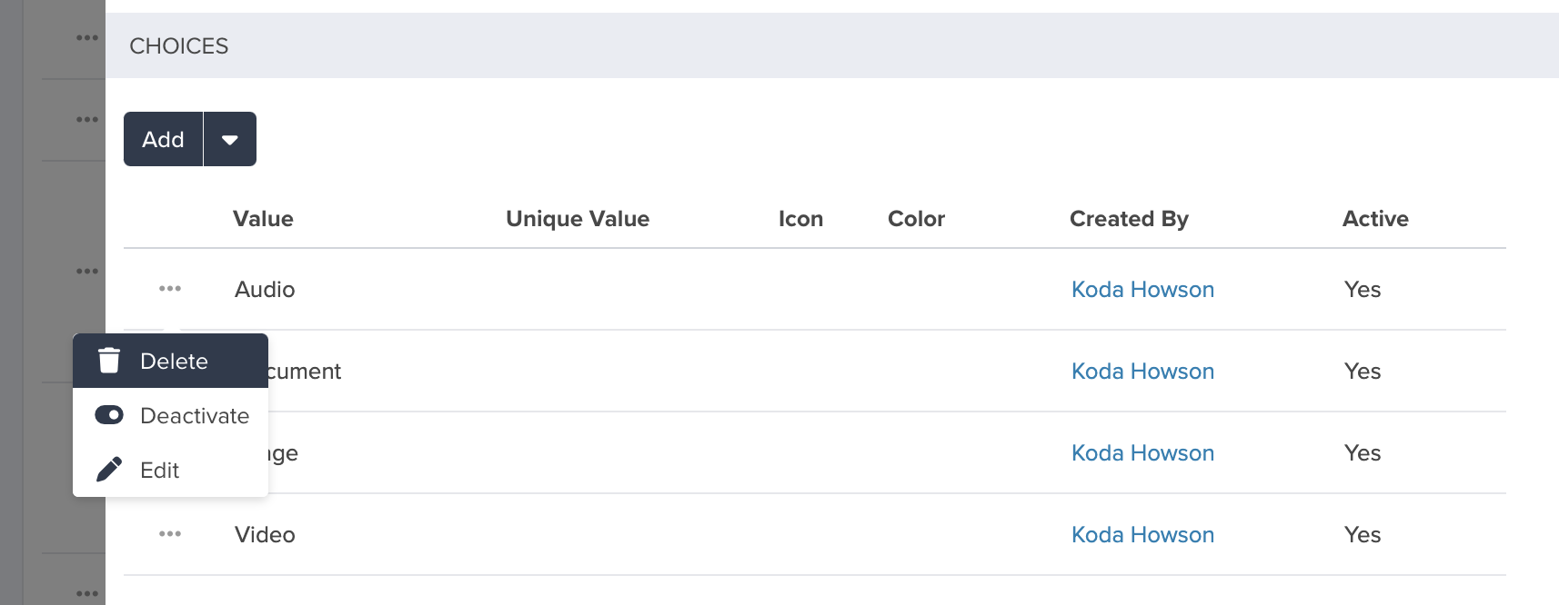
To delete, deactivate, or edit an individual choice, navigate to the parent Choice List and select the Choice. Under the ‘Choices’ select the options menu and make a selection.
You can edit the choice from the options menu as well.
For deactivation, you just click the ‘Deactivate’ button. To reactivate the choice, click on the ‘Show Deactivated’ checkbox, look for the choice you want to reactivate, click on the options menu, and click ‘Reactivate’.
Note: Choices created from plugins are not eligible for Deletion
Document Templates
Publish the details of your records in any App with a delightful, customer-facing PDF document. You can also choose the style and format that best suits you and your company by designing your template in Microsoft Word or Google Docs. Publishing PDFs is a great tool for generating Quotes or Proposals via FreeAgent!
Create your Template
First, we recommend that you either use Microsoft Word or Google Docs to create your desired document with all the styles and elements that you would like to have. It could be a quote, an invoice, or even a project proposal. Once you have something like the samples shown in the image below, it is time to prepare the template.
To create the template, you will be replacing the elements in your document with ‘tags’ (<<>>) that will point to an existing field within servis.ai. Let’s go through the second sample image step by step.
Identify replaceable elements
Start by identifying those elements in your document that can and need to be replaced by the actual values from your record. In the first sample image, we have identified a few values that should be replaced with values within the servis.ai record.
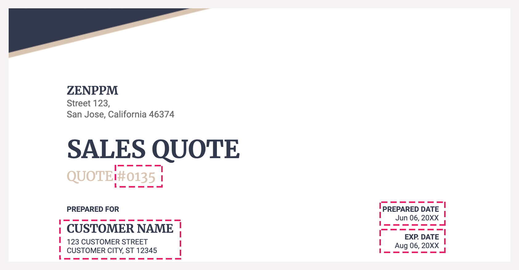
The top section includes your company’s information as part of the header and doesn’t change from quote to quote, so you can enter your company’s consistent information (name, address, etc.). However, the Quote ID is a field in servis.ai that changes from quote to quote, so the system must replace it on the creation of a new quote. Use the following tag: <<id>> since the servis.ai Field is called ‘ID’. We do the same for all the other replaceable elements, and we get:
The <<id>>, <<company>>, and <<address>> tags that are seen here are all available as fields within the ‘Quotes’ App. Please note that the name of the App, as well as the available fields, will change according to your own servis.ai configuration.
When the field name is composed of two or more words, your tag will need to be capitalized as follows: twoOrMoreWords -> the first word of the field name is lowercase, while the rest of the words are capitalized, and there shouldn’t be any spaces between words.
As for dates, they are available in the App as well; they just look slightly different from the other tags, as we are applying a specific format to them.
<<{dateFormat(yourDateFieldName,’MMM dd, yyyy’)}>> will print the date in the following format
Apr 06, 2020
There are some special formats that you can apply to your fields according to their type.
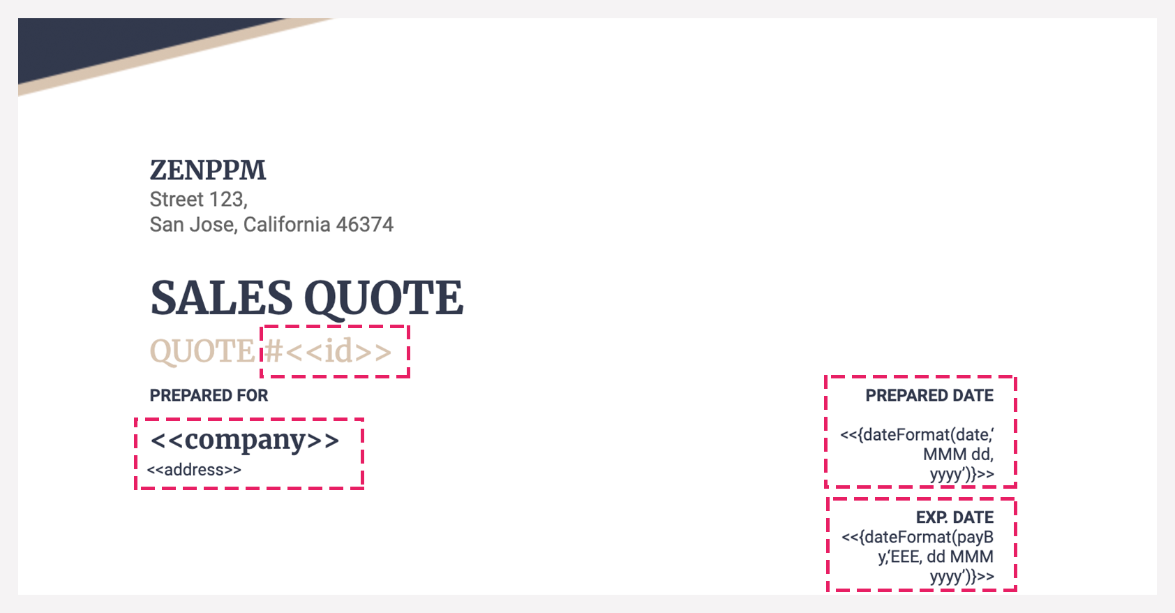
Let’s review the second half of the template. Now we will add the information for the lines in our App. This section should be set up as a table to identify each of the elements in a row. All the elements inside the table, except the column name, will be replaced by values from the lines in the App. Therefore, in the PDF template, the values have to become tags.
We just need one row for the items inside the table. We also need two additional rows to mark the beginning and the end of the lines within the table. The result would look something like this:
The column names are not replaced by tags. Then we have a row with <<rr_yourAppLine>> which tells the system that the information that follows comes from a line and not the App itself. If your line name includes two or more words, remove the space between the words and capitalize the first letter of all of the words except the first one, which needs to be lowercase. <<er_yourAppLine>> marks the end of the line elements in your template.
To display quantities, amounts (currency), and other fields with the number type, please review the special formats section.
Once the template is ready, save, export, or convert it to .docx as it is the only accepted format to import your template into servis.ai.
Note: There are some field types that are currently not supported in the PDF Template, such as the Choice List Multi Select field.
Special Formats
| Date Formats | Result |
|
<<yourDateFieldFormatted>> |
Changes according to your date field configuration (if masks are applied) |
|
<<{dateFormat(yourDateField, ‘dd MMM yyyy‘)}>> |
25 May 2020 |
| Date Time Formats | Result |
|
<<{dateTimeFormat(yourDateTimeFieldName,‘MMM dd, yyyy hh:mm’)}>> |
Apr 06, 2020 12:40 |
|
<<{dateTimeFormat(yourDateTimeFieldName,‘MMM dd, yyyy hh:mm:ss’)}>> |
May 27, 2020 11:37:12 |
|
<<{dateFormat(yourDateTimeFieldName,‘MM/dd/yyyy HH:mm:aa’, ‘yyyy-MM-dd’T’HH:mm:ss’)}>> |
12/25/2021 – 12:00PM |
You can specify a different format in the bold section to print your preferred date and time.
| Format | Description |
| dd | for a two-digit day |
| yyyy | for a four-digit year |
| MM | is the Month in numeric format |
| MMM | Is the Month abbreviated to the first three letters |
| MMMM | Is the month’s full name |
| mm | is for minutes |
| EEEE | The day expressed as a word |
| EEE | the day abbreviated to the first three letters |
| hh | is for hours in 12 hour notation |
| HH | is for hours in 24 hour notation |
| aa | is for AM/PM |
| Number Formats | Result |
| <<{numFormat(yourField,‘0.0’)}>> | 12.3 |
| <<{numFormat(yourField,‘$0.00’)}>> |
$12.34 |
| <<{numFormat(yourField,‘###.##’)}>> |
12.34 |
| <<{numFormat(yourField, ‘¤#,###.00’, ‘USA’)}>> |
$1,234.50 |
| <<{numFormat(yourField, ‘¤#,###.00’, ‘GBR’)}>> | £1,234.50 |
| <<{numFormat(yourField, ‘ #.###,00¤’, ‘DE’)}>> | 1.234,50€ |
Pro-Tip for Images
Suppose you are looking to add a logo to your PDF template or any other image.
Upload Template to App
Open the menu and go to ‘Admin Settings’ to display the available options, then click Advanced. From there click Document Templates. Click on the ‘Add Document Template’ button in the top left-hand of your screen.
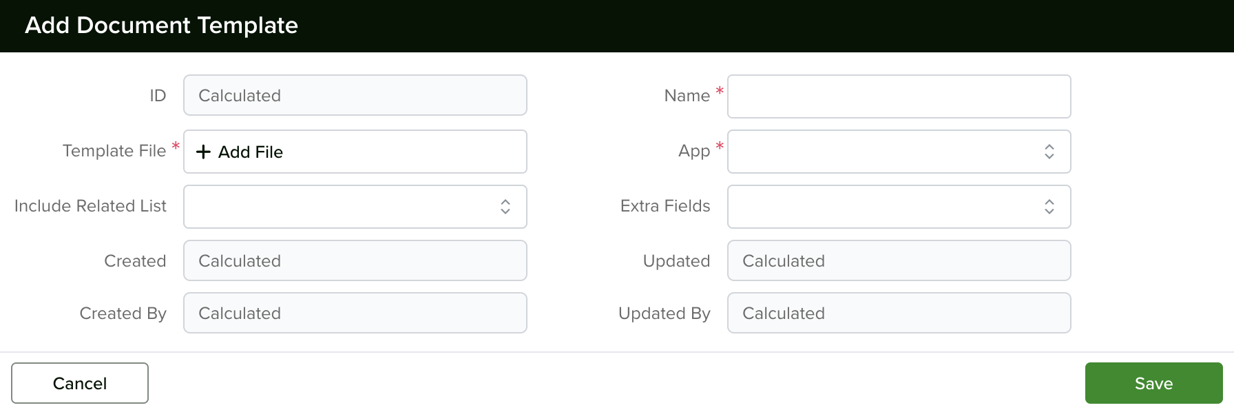
From here, choose a template name and add your file. Once ready, click Save to add your new template. You can add multiple templates to each App and edit them at any time.
Note: The only allowed type for the template is ‘.docx’
